
Previous Month | RSS/XML | Current
WEBLOG
July 18th, 2026 (Permalink)
Sorry, Wrong Number!
Quote: An individual study is a brick, and it only proves itself when incorporated into a useful structure. Bad bricks either get rejected as not fitting into the structure, or exposed when things built on them collapse. But the Wrong Numbers you'll find in this book do not try to fit into structures, they are used to throw through windows instead. They go direct to the public, claiming the authority of science. But it's cargo-cult science1. It looks like science, with equations and data and references and peer review and jargon, but it was never exposed to critical scrutiny, never cross-checked with related work, never used to build structures of understanding.2
Title: Wrong Number
Subtitle: How to Extract Truth From a Blizzard of Quantitative Disinformation
Author: Aaron Brown
Comment: Brown is a writer who has had an interesting career, including professional poker playing, financial risk management―whatever that is―and teaching mathematics in college3. He's the author or co-author of four previous books, including ones on risk and chance. He also has done a series of short videos with the same title as the new book4. According to Brown:
Almost half the chapters in this book are based on studies I examined for…videos, and include some phrasing and research contributed by the team. Bill Fallon, my editor…, noticed the attention generated by the videos and suggested that Wrong Number was a good theme for a book.5
So, if you like the videos then you may like the book, and vice versa.
Date: 2026
Summary: Judging from the Table of Contents and the first, introductory chapter, the chapters appear to be mostly case studies of bad scientific studies, like the short videos Brown has done. Based on their titles, some of the chapters appear to cover the same topics as do some of the videos, though presumably in greater depth.
The Blurbs: The book is positively blurbed by Philip Tetlock, author of Expert Political Judgment6, despite the fact that there is actually a chapter titled "Philip Tetlock"7! Given that I haven't read the chapter, I don't know whether it is positive or negative about Tetlock, though I'd wager that it's positive given the endorsement. While I don't doubt Tetlock's sincerity, it's an obvious conflict of interest to have a subject of the book endorse it in a blurb, especially without revealing that conflict.
Disclaimer: I haven't read this book yet and, therefore, can neither review nor recommend it, but it looks interesting enough to read and I thought others might also be interested. I may review the book in the near future if I have anything new or interesting to say about it.
Notes:
- ↑ If you're unfamiliar with "cargo cult science", see: Richard P. Feynman, "Cargo Cult Science", Caltech commencement address, 1974.
- ↑ And the planes don't land. P. 8. Subsequent citations to only page and chapter numbers are to the New Book.
- ↑ All information on Brown from: "About the Author", Wiley, accessed: 7/13/2016.
- ↑ For a list of episodes, see: "Wrong Number with Aaron Brown", YouTube, accessed: 7/14/2016.
- ↑ P. 9.
- ↑ Philip Tetlock, Expert Political Judgment: How Good is It? How Can We Know? (2005).
- ↑ Ch. 24.
July 8th, 2026 (Permalink)
Sow and Sew
Grandfather William sewed the seeds of this particular tragedy when he left a will that turned the estate into a trust because he wanted to cut out his wastrel first born son….1
The words "so", "sew", and "sow", in descending order of familiarity, are homophones, that is, they are pronounced identically. "So" is a common and highly ambiguous word with too many meanings to list, but what is important for our purposes is that in most of those meanings it's an adverb2, whereas both of the other homophones are verbs. So, it's more likely that the verbs will be confused with each other than with the adverb.
"To sew" means to use needle and thread in making or repairing clothes or other items3. It used to be a common word, but in 21st century America I don't think many people still make or mend their own clothes. "To sow", meaning to scatter or plant seeds, is the least familiar of the three4.
Google's Ngram Viewer, which graphically displays the frequency of words and phrases in books, shows the unsurprising result that "so" was far more common in the last century than "sew" and "sow"5. As a result, the difference between "sew" and "sow" is dwarfed by their distance from "so". Examining the latter two words separately reveals that "sow" has been more common most of the time than "sew", which is not what I expected. Less surprisingly is that, as the population became less agricultural and more urban in the first part of the last century, the frequency of "sow" declined, though it appears to have levelled off in the past fifty years. More surprisingly, "sew" has actually been used slightly more frequently in that time frame6. While a century ago, "sow" was several times more common than "sew", the two words are recently used at about the same frequency.
"Sow" is now seldom encountered in its literal meaning, but more often in such idioms as "sowing wild oats", "reaping what you sow", and "sowing the seeds of" something, such as tragedy in the sentence quoted above. In that example, grandpa Bill obviously sowed the seeds of that particular tragedy, whatever it was, rather than "sewed" them: what would "sewing" seeds mean?
Though I've seen it before, confusing these two words may not be a very common error since none of the reference books I usually consult discuss it. Perhaps it only occurs in the familiar idioms mentioned above. Bryan Garner does mention the mistake of "sewing" wild oats, and provides three examples from newspapers7. This is the same substitution shown in the example sentence that inspired this entry, but in a different though related idiom: to sow wild oats is a metaphorical sowing of a particular type of seed.
As with many of the other confusions we've seen in these entries, this one seems to go only one way, namely, "sew" is used where "sow" should be. I don't recall ever seeing it go the other way, which may be because city dwellers are more familiar with sewing than with sowing and, thus, don't know how the latter is spelled.
My fast and filthy tip to avoid confusing "sow" and "sew" is not to use tired idioms8 such as "sowing wild oats", "reaping what you sow", and "sowing the seeds of" something, especially if you're unsure what such phrases literally mean. Unless you write about farming or gardening, you'll probably never need the word "sow" in its literal meaning. Similarly, if you don't write about needlework or surgery, you probably won't need "sew".
So, don't "sew" the seeds of confusion or you will reap what you "sew".
Notes:
- ↑ Robert Thorogood, Death Knocks Twice (2017), p. 319
- ↑ "So", The Britannica Dictionary, accessed: 7/7/2026.
- ↑ "Sew", Ibid., accessed: 7/7/2026.
- ↑ "Sow", Ibid., accessed: 7/7/2026.
- ↑ "so,sew,sow", Google Books Ngram Viewer, accessed: 7/8/2026.
- ↑ "sew,sow", Google Books Ngram Viewer, accessed: 7/8/2026.
- ↑ Bryan Garner, Garner's Modern English Usage (2016), under "Sow".
- ↑ See: George Orwell, "Politics and the English Language", Horizon, Vol. 13, No. 76, 4/1946, p. 255, "Dying metaphors".
July 4th, 2026 (Permalink)
Independence Day at the Logicians' Club
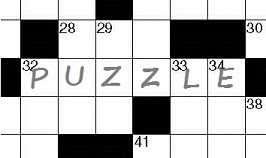
Those fun-loving logicians of the Logicians' Club (LC) celebrate Independence Day each year with a patriotic puzzle party, and what a wild party it is! This year's party was even wilder than usual since it celebrated the 250th anniversary of American independence. Here's how it went:
Every member wore a hat that was either red, white, or blue. The LC is, as I'm sure you know, a rather exclusive organization, so there were only six hats available: three red, two blue, and one white. The white hat was reserved for the president of the club, so all the regular members received either a red or blue hat. All of the club members were aware of these facts.
The president of the club was the first to arrive at the venue chosen for the party, and the first thing he did was make sure that the room had no mirrors or other shiny surfaces. When the first three members arrived, it was time to begin the festivities. Carrying the six hats in an opaque bag, the president approached each member from behind and placed a hat on the member's head in such a way that the member could not see its color. However, each member was able to see the color of the other two members' hats.
After the three members had each been issued a hat, the president asked one―Ms. X―what color her hat was.
"I don't know," Ms. X said, and the other two logicians heard her answer. The president turned to the second member, Mrs. Y, and asked the same question.
"I don't know," Mrs. Y said, and again the other two logicians heard her answer. The president turned to the final member, Professor Z, and asked the same question.
Prof. Z was just about to reply in the same way as the previous two logicians when he suddenly stopped and correctly gave the color of his hat.
What was the color of Prof. Z's hat? Are you LC material? If you can solve this problem, you are!
LC members will figure out the color of their hats from the information available if that's possible.
Members of the LC never lie, unless it is part of a game. Lying is not part of this game.
Red
Explanation: The important clue to this puzzle is that neither Ms. X nor Mrs. Y knew the color of her hat. The only way that Ms. X could know the color of her hat is if both Mrs. Y and Prof. Z were wearing blue hats, in which case X would realize that her own hat had to be red, since there were only two blue hats. So, when it comes Mrs. Y's turn, she knows that one or both of her and Prof. Z has a red hat. If Prof. Z's hat were blue, which Mrs. Y would see, then she would know her own hat must be red. Since she didn't know her own hat color, Prof. Z's hat must be red.
Previous Independence Day puzzles:
- A Patriotic Puzzle Race, 2004
- Independence Day Parade Puzzle, 2012
- A Fireworks Puzzle, 2013
- An Independence Day Puzzle at the Logicians' Club, 2019
- An Independence Day Patriotic Shoestring Puzzle, 2020
- A Second Meeting of the New Logicians' Club, 2021
- The Fourth of July Picnic, 2025
June 30th, 2026 (Permalink)
How to Lie With Notes 8: The Logrolling Citation1
Not everything that counts can be counted, and not everything that can be counted counts.2
The word "logrolling" seems to have come from a practice among frontier farmers of mutual aid. When a farmer needed help clearing a felled tree from a field, his neighbor would help roll the log away. It was implicitly understood that the farmer who received this help was obligated to help out his neighbor when he was in a similar predicament.
From this origin, the word or phrase spread to politics, where it refers to legislators trading votes3. For instance, suppose that Congresswoman D supports bill B more than she opposes law L, whereas Congressman R supports L more than he opposes B; then, D and R might agree to each vote for both pieces of legislation in order that their most favored bills get passed. If it weren't for logrolling, there might be little legislation passed―I'll leave it to you to decide whether that would be good or bad.
Logrolling passed from farming into politics, but how did it end up in such an arcane academic area as notes and citations in scholarly works? What logrolling in farming and politics have in common is cooperation: logrollers exchange favors for mutual benefit. Similarly, academic logrollers exchange favors to benefit each other's careers; specifically, logrolling in the context of notes and citations occurs when academics cite each others' works whether they deserve it or not.
So, what if anything is wrong with logrolling in citations? Logrolling in politics is sometimes defended as democratic compromise necessary to get anything done, but it's hard to see what positive value it might have in scholarship. As discussed previously though briefly4, citations indicate sources used in the citing work, additional reading for those who wish to delve further into the topic, or works that provide a different view or treatment of that topic. If Professor P cites Professor Q's work in a note, not because it serves one of the above purposes, but because P expects Q to return the favor by citing P's work, that indeed compromises the quality of P's scholarship. While a logrolling citation may help a scholar's career, what value does it have for the reader?
Logrolling is a difficult or even impossible transgression to prove since a logroller can always deny it, and there will seldom be evidence of a quid pro quo5 agreement, since explicit agreements are usually unnecessary. Moreover, unlike a phantom reference6 or zombie citation7, there's nothing about the note itself or the work cited that proves logrolling. If you're sufficiently knowledgeable in a scholarly field, certain citations might make you suspect logrolling, but unless the suspect admits it, you'll never be certain.
Why do scholars engage in logrolling? Citations in scholarly works are a way to draw attention to someone's work, especially if the citing scholar is well-known in the field. Thus, one purpose that citations serve is publicity. As a result, I assume there has always been some logrolling in scholarship, but the problem has become worse recently due to the rising emphasis on "metrics" in academia. The number of papers published and number of citations those papers receive are now used to measure the performance of scholars. This creates a pressure to get as many citations as possible, and one way to do so is by logrolling. However, to the extent that metrics measure anything worth measuring, logrolling pollutes them with meaningless citations added to "game" the metric.
The purpose of this series of entries is not to try to change academic politics, but to give you information that can be used to intellectually defend yourself against scholars behaving badly. Unfortunately, there's not much that you can do to defend against logrolling, since logrolled notes look exactly like sincere ones. So, unless the academy starts putting less emphasis on the quantity of scholarship and more on its quality, you're on your own8.
Notes:
- ↑ Previous entries in this series:
- Introduction, 10/23/2025
- Latin Abbreviations, 11/15/2025
- Anatomy of a Citation, 12/6/2025
- Ghost Notes, 1/3/2026
- Death by Footnote, 2/9/2026
- The Phantom Reference Menace, 3/8/2026
- The Zombie Citation, 5/24/2026
- ↑ Albert Einstein should have said this, but probably didn't. See: The Expanded Quotable Einstein, collected & edited by Alice Calaprice (2000), p. 318.
- ↑ Taegan Goddard, "Logrolling", Political Dictionary, accessed: 6/28/2026. See also: Hans Sperber & Travis Tritschuh, Dictionary of American Political Terms (1964).
- ↑ In the Introduction to this series; see note 1, above.
- ↑ Translation: "This for that", Latin. Jon R. Stone, Latin for the Illiterati: Exorcizing the Ghosts of a Dead Language (1996).
- ↑ See the sixth entry in this series; note 1, above.
- ↑ See the previous entry in this series; note 1, above.
- ↑ For a more optimistic assessment and suggestions, see: Jack Baker, "The corrupting effects of academic citation metrics", 8/21/2025.

June 21th, 2026 (Permalink)
Darkness at High Noon, Political Prejudices & Death by Endnote
- A Follow-Up:
In a book about the making of the movie High Noon and a congressional committee investigating communist influence in Hollywood, we read: "The committee had acted with malice and flaunted the civil rights of witnesses…."1 Did they flaunt them or flout them?2
- In one of his "Mathematical Games" columns later anthologized in a book, Martin Gardner wrote:
"Redistributive justice" is a phrase much heard these days in arguments among political philosophers. Should the ideal modern industrial state tax the rich for the purpose of redistributing wealth to the poor? Yes, says Harvard philosopher John Rawls in his influential book A Theory of Justice. No, says his colleague (they have adjoining offices) Robert Nozick in his controversial defense of extreme libertarianism, Anarchism, State and Utopia3. It is hard to imagine how two respected political theorists, both believing in democracy and free enterprise, could hold such opposing views on the desirable powers of government.4
This paragraph introduced a mathematical puzzle that has a slight relationship to the issue of "redistributive justice", but none to either Rawls or Nozick's views. I'm not sure why Gardner mentioned them unless it was just to drop their names. What interests me in the passage is the revealing way that Gardner characterizes their works, though not revealing about Rawls or Nozick, but about Gardner.
According to Gardner, Rawls' book is "influential". No doubt that's true, but isn't Nozick's also influential? Perhaps Rawls is more influential than Nozick, but that's hard to judge; even so, Nozick has certainly been influential. So, why is only the influence of Rawls mentioned?
In comparison, Nozick's book is a "controversial" defense of "extreme" libertarianism. Isn't Rawls' book also controversial? It's certainly controversial with libertarians, but also with Marxists and other socialists who think it's not extreme enough. Why doesn't Gardner call A Theory of Justice "a controversial defense of extreme liberalism"?
You might counter that Rawls' version of liberalism isn't extreme, but what's so "extreme" about Nozick's libertarianism? Perhaps libertarianism itself is "extreme", but as libertarianism goes, Nozick was mainstream. If you want extreme libertarianism you have to go with anarcho-capitalism.
In political language, "extreme" and "extremist" are words that often lack substantive meaning. Instead, they reveal that those who use them consider those so labeled―or libeled?―too far out there. So, an "extreme rightist" is someone farther to the right than the speaker, and an "extreme leftist" is farther to the left than the labeler.
Now, I don't mean to criticize Gardner for using this kind of language, but to point out that these three words tell us nothing much about either Rawls or Nozick. Rather, they tell us that Gardner liked Rawls and didn't like libertarianism, which is further indicated by the fact that he got the name of Nozick's book wrong: perhaps he didn't read it or only did so superficially.
In any case, Gardner was as entitled to his political prejudices as anyone else, but his use of such prejudiced language should not prejudice us in favor of Rawls or against Nozick. Both philosophers' work should be judged on its own merits and not because it's "influential", "controversial", or "extreme"―according to Martin Gardner.
- Another Follow-Up:
The following is from a book about scholarly scandals in the writing of history:
[Michael] Bellesiles was not the first and will not be the last scholar to falsify his research. But his case is the most egregious of our era…. For Bellesiles used the assumptions of the new history against it…. He knew that many in the liberal academic community strongly supported a gun control position, but a new history-style book…would only be read by a handful of other scholars and would not have much impact on the national debate. There was another way to sell the message, however. Publish the book with a trade press so as to claim the kind of immunity from close professional scrutiny that the popular history authors enjoyed, but pack the book with pages and pages of endnotes, to display the skills of a professional historian. … Dazzle the reader with erudition and hammer the opposition with arguments. … Bellesiles almost got away with it.5
The latter part of this passage is a nice description of what I call "death by footnote"6―or endnote in this case―that is, using "pages and pages" of notes to "dazzle the reader with erudition" and thereby intimidate or overwhelm the skeptic.
Notes:
- ↑ Glenn Frankel, High Noon: The Hollywood Blacklist and the Making of an American Classic (2017), p. 90
- ↑ Flaunt or Flout, 8/2/2021
- ↑ Robert Nozick, Anarchy, State and Utopia (1974).
- ↑ Martin Gardner, The Last Recreations: Hydras, Eggs, and Other Mathematical Mystifications (1997), pp. 333f.
- ↑ Peter Charles Hoffer, Past Imperfect: Facts, Fictions, Fraud―American History from Bancroft and Parkman to Ambrose, Bellesiles, Ellis, and Goodwin (2007), pp. 142f. Paragraphing suppressed.
- ↑ See: How to Lie With Notes 5: Death by Footnote, 2/9/2026.
June 16th, 2026 (Permalink)
E. G. V. I. E.
The title of this entry means "e. g." versus "i. e.", that is, these two abbreviations pitted against each other. Both abbreviate Latin phrases: "i. e." abbreviates "id est", which translates into English as "that is", "that is to say", or "in other words"1, and it's properly used in any place where its English translations would make sense. "E. g." is short for "exempli gratia", which means "for the sake of example", and is correctly used wherever "for example" or "for instance" would be used in English2.
I was prompted to think about these two abbreviations by the following highly technical sentence from an otherwise not highly technical book I've been reading: "The action of the amygdalae3…can be sufficiently powerful that we may become fearful under circumstances where we have nothing objectively to be fearful about, i. e., while watching a horror movie.4" If you substitute "that is" for the abbreviation, you can see that the Latin phrase is not what is wanted. Horror movies are just an example of "circumstances where we have nothing objectively to be fearful about" but which may activate the parts of the brain that respond to danger; other examples are thrill rides such as rollercoasters and "haunted houses" at amusement parks. So, "e. g." should replace "i. e." in this sentence.
Confusing these two abbreviations appears to be a common error; I've seen it many times and was simply reminded of it by the example. Eugene Ehrlich even remarks about "e. g.": "It is used correctly to introduce an example, incorrectly to mean 'that is'5", which would be a gratuitous comment unless that mistake were common. He also comments:
The abbreviation i. e. is heard more and more in the speech of those who do not know the Latin phrase―nor even the meaning of the term―so misuse is almost as common as correct use. The most frequent mistake reflects confusion of i. e. with e. g.…6
Further evidence, if it is needed, that this is a common confusion is that several of the reference books I consult include it7.
As with many of the other confusions we've seen, this one seems to go mostly one way, namely, "i. e." is used where "e. g." should be, as in the example. I don't recall ever seeing it go the other way, which may be because "i. e." is the more familiar of the two abbreviations.
I like Latin, but agree with Ehrlich that "[p]erhaps we are better advised to use the English equivalents in place of these abbreviations"8. Fluent English users are unlikely to confuse "that is" and "for example". So, my fast and filthy tip to avoid this confusion is simply to write in English, unless space is at a premium as in footnotes9.
Notes:
- ↑ Eugene Ehrlich, Amo, Amas, Amat and More: How to Use Latin to Your Own Advantage and to the Astonishment of Others (1985).
- ↑ Ibid.
- ↑ Parts of the brain.
- ↑ Richard Restak & Scott Kim, The Playful Brain: The Surprising Science of How Puzzles Improve Your Mind (2010), p. 236.
- ↑ Ibid., under "exempli gratia".
- ↑ Ibid., under "id est".
- ↑ They are:
- Bill Bryson, Bryson's Dictionary of Troublesome Words: A Writer's Guide to Getting it Right (2002)
- Mignon Fogarty, Grammar Girl's 101 Misused Words You'll Never Confuse Again (2011)
- Adrian Room, The Penguin Dictionary of Confusibles (1980)
- Harry Shaw, Dictionary of Problem Words and Expressions (Revised edition, 1987)
- ↑ Loc. cit. I think the same is good advice with respect to the names of logical fallacies: you should use an English name whenever one is available.
- ↑ Endnotes usually have more space, which is a good reason to use them instead of footnotes.
June 14th, 2026 (Permalink)
The Long, Hot European Summer
Here are two headlines from about a year apart:
Heat claims more than 175,000 lives annually in Europe, latest data shows1
Over 62,700 Deaths Associated with Record-breaking Heat During the Summer of 2024 in Europe2
The UN's 2024 estimate of the annual death toll due to heat, reported in the first headline above, is nearly three times what was reported the next year by the Barcelona Institute for Global Health (ISGlobal) for 2024, according to the second headline. What accounts for this discrepancy?
ISGlobal reported exactly 62,775 deaths for the summer of that year in Europe3. Interestingly, ISGlobal previously reported 61,672 heat-related deaths in 20224 and 47,690 in 20235, so its numbers have been consistently much lower than the UN's estimate of annual deaths. In addition, the fact that these numbers are not rounded off suggests that they are an attempt to count the deaths rather than just estimate them.
As I pointed out last month6, to count something you first have to define it. There are at least two concepts that need defining before we can count the heat deaths in Europe in 2024: "Europe" and when a death is attributable to heat.
In these reports you'll find references to "heat-related causes", "heat-related deaths", "heat-related mortality", "heat-related complications"7, as well as "heat stress" and "heat shocks"1. What counts as a heat-related fatality? For instance, would drowning count as a death from heat? I mention drowning only because recent news reports on the current "heat wave" in Europe discuss cases of drowning as "potentially heat-related deaths"8. It's not entirely implausible: when it gets very hot, people seek physical relief, and one way they do so is by swimming. Thus, the number of drowning deaths may increase during unusually hot weather. However, it's summer and people swim in the summer even when it's not unusually hot; would all drowning deaths during a heat wave be counted as heat-related or only excess deaths, that is, those exceeding the average number of drownings?
As a result of the vagueness of "heat-related death", there will be a lot of room for different counts. If the researcher is most worried about missing such deaths, a broad definition of "heat-related" will be used, and borderline cases will be classified as heat-related in order to avoid under-counting. In contrast, if the researcher is most worried about over-counting, a narrow definition will be used and unclear cases will be excluded. How much of the difference between the UN estimate and the ISGlobal counts is due to different definitions of "heat-related death"? Also, the precise counts down to the units column given for the past few years by ISGlobal are inevitably misleading. There's no way that such a fuzzy concept can be counted with that kind of precision.
In contrast to the imprecision of deaths due to heat, "Europe" appears to be a precise concept. However, if you delve into the UN report below the headline, you'll discover that it is estimating deaths in what it calls "the European region". Is the "European region" the same as what ISGlobal calls "Europe"? According to the UN, the "European region" includes 53 countries9, whereas ISGlobal states that its data covers 32 countries10. Presumably, the nations of Europe are a proper subset of those in the "European region". How much of the difference between the UN and ISGlobal counts is due to the difference between Europe and the European region?
I don't know the answer to these questions, and I don't raise them to answer them―I'm a logician, not a public health expert. These are questions that the editors who wrote the above headlines, and the reporters who wrote the stories beneath them, didn't even ask let alone answer, which is sadly typical of so much science reporting. As a result, we readers get headlines that clearly contradict one other, yet there's no way to tell which is right. Probably both are wrong, but how wrong?
According to the National Weather Service, 2024 saw a total of only 529 "heat-related fatalities" in the United States of America11! Given that the population of Europe12 is less than twice that of the U.S.13, what can account for an over hundred-fold difference in heat-related fatalities in the same year?
Excluding Alaska―I doubt very many Alaskans die from the heat―almost all of the U.S. is between 25 and 50 degrees North latitude14, whereas Europe is between 35 and 70 degrees North15. So, everything else being even, one would expect the latter to be colder and thus to have fewer fatalities due to heat―but everything else is seldom even.
According to an article in Slate, Europe has far less air conditioning than the U.S.16 Specifically, only 10% of European households have air-conditioners as opposed to 90% of those in the U.S.17 How much of the two orders-of-magnitude difference in heat deaths is accounted for by this difference in air conditioning?
Despite these facts, you might not know that air conditioning even exists if you rely on news stories about the European heat waves. For instance, in a report about the UN estimate18, the words "air conditioning" and "air conditioner" do not occur, even though both blinds and shutters are mentioned as ways to mitigate the heat. If you were an alien basing what you know about Earth on these reports, you'd think that Earthlings lack the technology to cool their dwellings.
According to recent news reports19, this summer in Europe is threatening to be another hot one and people are already dying. If the above statistics are to be believed, we should expect total deaths in the tens of thousands. Many, probably most, of these deaths will be of the elderly, who are more susceptible to the ill effects of high heat than young people20. Even if we take the lowest estimates of deaths due to heat in Europe in recent years, the numbers are shocking, especially in comparison with those for the U.S. If even a fraction of the lowest estimates could be avoided by air conditioning, shouldn't Europe start a crash program to air condition the continent before next summer kills tens of thousands more elderly Europeans?
Notes:
- ↑ "Heat claims more than 175,000 lives annually in Europe, latest data shows", UN News, 8/2/2024.
- ↑ "Over 62,700 Deaths Associated with Record-breaking Heat During the Summer of 2024 in Europe", Barcelona Institute for Global Health (ISGlobal), 9/22/2025.
- ↑ Given that most heat-related deaths happen in the summer, the difference between the number for the summer and that for the whole year cannot account for the entire discrepancy with the UN's estimate, though it might account for a small amount of it.
- ↑ "Record-breaking Heat in the Summer of 2022 Caused more than 61,000 Deaths in Europe", ISGlobal, 7/10/2023.
- ↑ "Heat Caused Over 47,000 Deaths in Europe in 2023, the Second Highest Burden of the Last Decade", ISGlobal, 8/12/2024.
- ↑ Doing Violence to the Data, 5/2/2026.
- ↑ Alison Withers, "Europe had over 62,700 heat-related deaths in 2024, report finds", Reuters, 9/22/2025.
- ↑ For instance: Matthew Cappucci & Daniel Wu, "A deadly heat wave hits Europe, with decades-old temperature records falling", The Washington Post, 5/27/2026.
- ↑ "2025 AMWHO Regional Guide (Euro)", 2025 AMWHO International Conference.
- ↑ Janoš, T., Quijal-Zamorano, M., Shartova, N. et al., "Heat-related mortality in Europe during 2024 and health emergency forecasting to reduce preventable deaths", Nature Medicine 31, 4065-4074 (2025).
- ↑ "2024 Heat Related Fatalities", National Weather Service, 3/24/2026.
- ↑ "What is the current population of Europe?", Wolfram Alpha, accessed: 6/12/2026.
- ↑ "What is the current population of the United States of America?", Wolfram Alpha, accessed: 6/12/2026.
- ↑ Rand McNally World Atlas (1988), p. 33.
- ↑ Ibid., p. 3.
- ↑ Henry Grabar, "Paris Is Burning. So Why Won't Europeans Install A/C?", Slate, 8/10/2022.
- ↑ Another estimate has it at 20%; see the article under note 8, above.
- ↑ Lottie Limb, "'Ultimate price': 175,000 Europeans die heat-related deaths a year, WHO warns", EuroNews, 1/8/2024.
- ↑ Jill Lawless, "Exceptionally early heat wave shatters records and brings deaths in Europe", Associated Press, 5/26/2026.
- ↑ Stephanie Dutchen, "The Effects of Heat on Older Adults", Harvard Medicine, Autumn 2021.
June 4th, 2026 (Permalink)
How to Solve Logic Puzzles with Euler Diagrams
In a couple of previous entries, I explained how to use Venn diagrams to solve certain types of logic puzzle1. In this one, I'll show how you can do so with Euler diagrams instead. I've previously explained the difference between these two types of diagram, so I won't do so again2. Let's begin with an easy example; try to solve the following puzzle with any method you please, or none at all. Here are the clues:
- Anyone's aunt is somebody's sister.
- Ants are six-legged insects.
- Nobody's sister has six legs.
Based on these three clues, what can you conclude about the relation between ants and aunts?
There are four classes mentioned in the three clues: aunts, sisters, ants, and insects. There could be a fifth class, namely, six-legged animals, but since all insects have six legs and almost all animals that have six legs are insects, let's treat insect and six-legged as the same class. Moreover, as we shall see, the clues are either A-type or E-type categorical statements. So, this puzzle is a good candidate for an Euler instead of a Venn diagram, since Venn diagrams for more than three classes are problematic, as are Euler diagrams of I-type or O-type categorical statements.
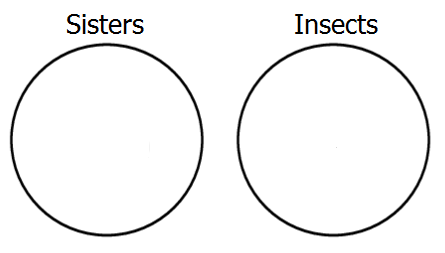
Let's start by representing the third premiss, which says that the classes of sisters and insects are disjoint, that is, it's E-type. To show this with an Euler diagram, we construct two non-overlapping circles, like so:
Next, represent the first premiss, which tells us that all aunts are sisters, which is A-type. To show this in the diagram, we place the circle representing aunts completely within the circle of sisters.
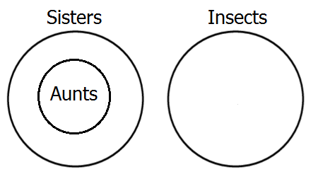
Finally, represent the second premiss, which says that all ants are insects―another A-type―by placing a circle for ants inside the insect circle.
We're done diagramming! Now, we just need to look at the diagram and see what relation it shows between ants and aunts. Obviously, the diagram shows that the class of ants and the class of aunts are disjoint, in other words, no aunts are ants. I'm sure you already knew that, but it's to nice to see it proved.
The most difficult part of the puzzle was not the diagramming, but representing the clues as relations between classes. Here's a harder puzzle to practice your Euler diagramming skills on:
- Detective stories are a type of genre fiction.
- Literary snobs like only literary fiction.
- Poe's Dupin stories are the first real detective stories.
- Genre fiction is highly popular with most readers.
- Literary fiction is not popular.
Do literary snobs like Poe's stories about Dupin?
All of the clues are either A-type or E-type statements.
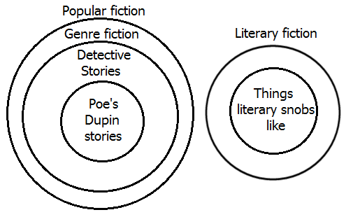
Here's an Euler diagram displaying the logical relations between the classes mentioned in the clues. As you can see, the diagram shows that literary snobs don't like Edgar Allan Poe's Dupin stories. That's why they're snobs!
Disclaimer: No sisters, aunts, ants, or other insects were harmed in the making of these puzzles, but some literary snobs may have had their feelings hurt. Sorry.
Notes:
- ↑ See: Using Venn Diagrams to Solve Puzzles, Part 1, 1/18/2017 & Part 2, 3/7/2017.
- ↑ See: Lesson in Logic 12: Two-Circle Venn Diagrams, 7/16/2016, Lesson in Logic 16: The Third Circle, 2/16/2017 & Lesson on Logic 21: Euler Diagrams, 8/20/2025.