WEBLOG
Previous Month | RSS/XML | Current | Next Month

June 26th, 2012 (Permalink)
Translation and Scope
Slate had an article last month―I'm just now getting around to mentioning it―concerning the difficulties of computer translation between natural languages. Some pioneers of artificial intelligence thought that translating from one language into another would be a simple matter of programming the lexicon and grammar of each language, then the computer would take a sentence from one language, replace its words with synonymous words in the other language, and rearrange the words to preserve the sentence's grammar. However, the ambiguity of language is much greater than these researchers realized.
First of all, almost every word in a natural language will have more than one meaning, so that a simple one-to-one mapping of vocabulary is not possible. What a word means in a given sentence is partly a function of context, which includes the meanings of other words in the sentence, but also the meanings of surrounding sentences in a larger discourse. Moreover, much ambiguity is resolved by the larger context of the discourse, including the environment in the vicinity, as well as background information shared by the people communicating. So, a great deal more information than just a lexicon and grammar are needed to translate any but the simplest sentences, and current computer translators just don't have access to the necessary environmental or background information.
Secondly, grammar can be ambiguous as well, that is, sentences may be amphibolous. The article discusses a particular type of amphiboly, specifically, a type of scope ambiguity, but doesn't do much to explain it:
You have to deal with things like imprecise quantifier scope. Take the sentence “Every man admires some woman.” Now, this has two meanings. The first is that there exists a single woman who is admired by every man. … The second is that all men admire at least one woman. But how do you say this in Arabic? Ideally, you aim for a phrase that has the same levels of ambiguity. The point of the semantic approach is that rather than attempt to go straight from English to Arabic (or whatever your target language might be), you attempt to encode the ambiguity itself first. Then, the broader context might help your algorithm choose how to render the phrase in the target language.
In this example, the sentence has two quantifiers―"every" and "some"―and it's ambiguous as to which has widest scope:
- "Some" has widest scope: In standard logical notation:
∃y{Woman(y) & ∀x[Man(x) → Admires(x,y)]}
This interpretation is most likely to be correct when the word "some" is emphasized: “Every man admires some woman”. However, this is a rather implausible reading, unless perhaps "every" is understood in a restricted way such as "every man in the room".
- "Every" has widest scope:
∀x{Man(x) → ∃y[Woman(y) & Admires(x,y)]}
This is the most natural reading of the written sentence without any emphasis, especially since it's the more likely to be true.
Sources:
- "If You Are Stolen", Funny Signs
- Konstantin Kakaes, "Why Computers Still Can’t Translate Languages Automatically", Slate, 5/11/2012
Resource: Lost in Translation, 1/9/2006
June 21st, 2012 (Permalink)
I'm with Stupid
One has to belong to the intelligentsia to believe things like that: no ordinary man could be such a fool.―George Orwell
Jonah Lehrer has a recent article in the The New Yorker containing a couple of puzzles that you might like to try before reading the whole thing, which reveals the answers. If you haven't seen these or similar puzzles before, working them before reading the article should prove a worthwhile experience, and they'll only take a minute or two:
- "Here’s a simple arithmetic question: A bat and ball cost a dollar and ten cents. The bat costs a dollar more than the ball. How much does the ball cost?"
- "In a lake, there is a patch of lily pads. Every day, the patch doubles in size. If it takes 48 days for the patch to cover the entire lake, how long would it take for the patch to cover half of the lake?"
Now, go read the article, then come back here.
You're back! I have a few comments about the article:
When people face an uncertain situation, they don’t carefully evaluate the information or look up relevant statistics. Instead, their decisions depend on a long list of mental shortcuts, which often lead them to make foolish decisions. These shortcuts aren’t a faster way of doing the math; they’re a way of skipping the math altogether.
It's true that these "shortcuts"―or "heuristics" or "rules of thumb", as they are also called―sometimes, perhaps even often, lead us astray. However, we wouldn't take these shortcuts if they didn't work most of the time, at least in the environment in which our ancestors lived. Puzzles such as the ones in the article can fool people by exploiting unusual situations in which our intuitions lead us astray, but one thing that research in artificial intelligence (AI) has shown is that mental shortcuts are one of the things that make us smart. In real life, time is often of the essence and a rule of thumb that is fast and usually right can be of more value than an algorithm that is always right but slow to calculate.
Although [Daniel] Kahneman is now widely recognized as one of the most influential psychologists of the twentieth century, his work was dismissed for years. Kahneman recounts how one eminent American philosopher, after hearing about his research, quickly turned away, saying, “I am not interested in the psychology of stupidity.”
Stupid philosopher!
The philosopher, it turns out, got it backward. A new study…suggests that, in many instances, smarter people are more vulnerable to these thinking errors. Although we assume that intelligence is a buffer against bias―that’s why those with higher S.A.T. scores think they are less prone to these universal thinking mistakes―it can actually be a subtle curse.
This sounds counter-intuitive, but only before you realize that it's the shortcuts that make people smart! For that reason, it's to be expected that smarter people are more susceptible to making the kind of errors that come from using them. Unfortunately, the psychologists who study the errors that result from using shortcuts are probably not familiar with the AI literature on heuristics, and therefore don't appreciate their value. At any rate, the idea that intelligent people are sometimes especially stupid is counter-intuitive, but it's not exactly a new observation―see, for instance, the Orwell quote above.
However, I'm not sure how the two puzzles above, as interesting as they are, are supposed to fit into this discussion. Are the wrong answers that people give supposed to be the result of specific shortcuts? Are smart people more likely to get them wrong? Lehrer writes:
Education…isn’t a savior;…more than fifty per cent of students at Harvard, Princeton, and M.I.T. gave the incorrect answer to the bat-and-ball question.
But what percentage of people who don't attend any of those three schools get the question wrong? If it's greater than 50%, then either education or native intelligence would seem to have some positive effect.
Perhaps our most dangerous bias is that we naturally assume that everyone else is more susceptible to thinking errors, a tendency known as the “bias blind spot.” This “meta-bias” is rooted in our ability to spot systematic mistakes in the decisions of others―we excel at noticing the flaws of friends―and inability to spot those same mistakes in ourselves.
I've not heard the name "bias blind spot" previously, but I've certainly been long aware that this is a big problem. I've often worried that the main effect of The Fallacy Files may be to make people more fault-finding of others' reasoning, rather than improving their own, which is what I'd like to see happen. However, I have no idea what to do about this problem, other than occasionally mentioning it―like now, for instance―and hoping that people take the hint.
…[H]ere’s the upsetting punch line: intelligence seems to make things worse. The scientists gave the students four measures of “cognitive sophistication.” …[A]ll four of the measures showed positive correlations, “indicating that more cognitively sophisticated participants showed larger bias blind spots.” This trend held for many of the specific biases, indicating that smarter people…and those more likely to engage in deliberation were slightly more vulnerable to common mental mistakes.
I'm not surprised that the "bias blind spot" would be worse in intelligent people given that it seems to be a type of over-confidence. However, I'd like to know which of the "specific biases" is positively correlated with intelligence, and I'd be very surprised if anchoring is one of them. I guess that I'll have to read the actual paper to find out.
Sources:
- Jonah Lehrer, "Why Smart People are Stupid", The New Yorker, 10/12/2012
- George Orwell, "Notes on Nationalism"
June 18th, 2012 (Permalink)
Shifty Headlines
In election-year shift, Obama announces 'mend' to immigration policy
The Ins And Outs Of Obama's Immigration Shift
New Calculations on Immigration After Obama Shift
The buzzword for President Obama's changes in policy appears to have evolved. We saw last month that many in the news media called Obama's change in same-sex marriage policy an "evolution" rather than a "change" or, heaven forbid, a "flip-flop". Now, it appears that the word for the day is "shift". The above three headlines are just a sample of many that characterize the change in Obama's immigration policy as a "shift", and I can't find a single one from a major news outlet that refers to it as an "evolution".
There was a reason why "evolution" was the favored word for the change on same-sex marriage, because Obama had earlier used the word "evolve" in reference to his views on the subject (see the Source, below). So, naturally enough, when the change came it was widely described as an "evolution". But why the shift to "shift"? I can understand why "evolution" was dropped en masse, but how is it that so many disparate news sources have simultaneously switched to "shift"?
At least "shift" is a neutral word, as opposed to "evolve" or "flip-flop".
Source: "Obama's Interview With Progressive Bloggers (FULL TRANSCRIPT)", The Huffington Post, 10/27/2010
Resource: Headlines, 5/9/2012
June 17th, 2012 (Permalink)
A Father's Day Puzzle
A man standing looking at a portrait recited the following poem:
"Though I have neither son nor daughter,
"My father's son is this man's father."
What is the relationship between the poet and the man in the painting?
June 6th, 2012 (Permalink)
The Puzzle of the Four Conspirators
The Agency for Counter-Terrorism (ACT) has a house under surveillance. So far, the four men inside have stayed out of sight, but ACT has managed to electronically eavesdrop upon some of their communications. The only clues to their identity have come from snippets of conversation ACT has intercepted.
In these communications, the four have been called by the first names Alan, Bill, Charles, and David, as well as the last names Ericson, Fredericson, Garrison, and Harrison. However, ACT has not been able to determine which first names go with which last ones. Since these names are so common, attempting to identify the four suspects without their full names would be almost impossible. From its surveillance, ACT has been able to acquire only five additional clues as to their identities:
- Either Charles is named Garrison or David is.
- If Ericson is not named Bill, then David must be named Harrison.
- If Charles is named Garrison, then Fredericson does not have the first name David.
- If David has the last name Garrison, then Harrison does not have the first name Alan.
- Harrison does not have the first name David.
Can you help the ACT identify the full names of each of the four suspects?
Resource: The Puzzle of the Three Conspirators, 4/19/2012
June 4th, 2012 (Permalink)
Charts and Graphs
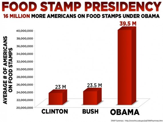
While we're on the subject of misleading charts, here's another that seems to have circulated around various websites―I haven't been able to track down where it originated (see the top chart, shown). Again, in looking at this chart, let's assume that the numbers are all correct, as we're doing a logic check rather than a fact check.
To start with, just glance at the chart: don't examine it closely, pay no attention to the numbers, and just get a quick impression of it. What do you conclude? I suspect that you would conclude that the number of people on food stamps during the Clinton and Bush administrations was approximately the same, whereas the number of recipients under Obama has soared to about four times what it was previously (the bar for Obama is actually slightly more than four times as tall as that for Bush).
Now, read the numbers. According to the chart, the average number of food stamp recipients under Clinton was 23 million, under Bush it was 23.5 million, while the number under Obama is 39.5 million. Thus, the increase from Bush to Obama is 16 million, as the chart says at the top. This is clearly not even close to a quadruple increase; rather, it's about a 68% increase.
The reason for this difference is because the vertical scale begins at 20 million instead of zero, so that we're seeing only the tips of the Clinton and Bush bars and half of the Obama one, though there's no indication in the chart itself that the vertical scale has been truncated.
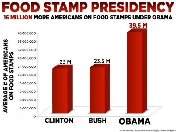
The information in this chart is so simple that it could easily be given in numerical form, as I have above, which is just as informative with less deception. In fact, the only reason I can see to present it as a graph is to take advantage of the deceptiveness of truncating and stretching it vertically to exaggerate the differences between the bars. However, in order to show what an honest version of the graph would look like, in the second version I've corrected the scale to begin at zero and adjusted the heights of the bars to accurately reflect the numbers.
Source: "Obama, the food stamp president", Western Free Press, 1/12/2012
Resource: Darrell Huff, How to Lie with Statistics (1954), Chapter 5: "The Gee-Whiz Graph"
June 1st, 2012 (Permalink)
Hey, Big Spender
Rex Nutting, a writer at The Wall Street Journal's Market Watch site, has one of those "everything you think you know is wrong" articles, this one claiming that President Obama is not really the big spender that everyone seems to think he is. Now, my concern here is not to fact-check Nutting's claims―that's already been done by some of the fact-checking sites (see the Resource, below, for a good one). Rather, let's accept all of Nutting's "facts", figures, and calculations, and see whether they really support his conclusion.
Read the opening sentences carefully:
Of all the falsehoods told about President Barack Obama, the biggest whopper is the one about his reckless spending spree. As would-be president Mitt Romney tells it: “I will lead us out of this debt and spending inferno.” Almost everyone believes that Obama has presided over a massive increase in federal spending, an “inferno” of spending that threatens our jobs, our businesses and our children’s future. Even Democrats seem to think it’s true. But it didn’t happen. Although there was a big stimulus bill under Obama, federal spending is rising at the slowest pace since Dwight Eisenhower brought the Korean War to an end in the 1950s.
Notice that Nutting starts out to refute "the biggest whopper" about Obama, which is "his reckless spending spree". However, by the end of this excerpt, he's talking about the rate at which spending has increased. These are not the same thing, but throughout the article Nutting conflates spending with increasing spending, for instance:
There has been no huge increase in spending under the current president, despite what you hear. Why do people think Obama has spent like a drunken sailor?
At one point in the article Nutting reveals an important piece of information:
Like a relief pitcher who comes into the game with the bases loaded, Obama came in with a budget in place that called for spending to increase by hundreds of billions of dollars…. By no means did Obama try to reverse that spending. Indeed, his budget proposals called for even more spending in subsequent years.
So, it was President Bush who increased spending, and President Obama just came in and continued spending at the same level. Assuming that Bush increased spending to the drunken sailor level, then Obama has continued spending like a drunken sailor, contrary to Nutting's original claim. This is an example of what's called in logic "ignoratio elenchi", that is, setting out to prove one thing but proving something else. In this case, the something else proven is close enough to what Nutting set out to prove that some people may be fooled into thinking that he succeeded.
Source: Rex Nutting, "Obama spending binge never happened", Market Watch, 5/22/2012
Resource: Glenn Kessler, "The facts about the growth of spending under Obama", The Fact Checker, 5/25/2012
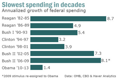
Update (6/2/2012): A chart accompanying Nutting's article is also worth mention (shown). This chart is very similar to one that was circulating back in January that purported to show that Obama had contributed less to the public debt than any previous president in the last thirty years, and that both Democrat presidents in that period ran up less debt than each of the three Republican presidents (see the Resource, below). There were multiple problems with that chart, but the main one was that the increase in debt was shown as a percentage of existing debt, which had increased steadily in the thirty years covered. This had the effect of favoring more recent presidents, since the base of the percentage grew with time.
The chart accompanying the Nutting article covers the same period of time, and also shows growth in percentages, though it tracks growth in spending rather than debt. However, it has the same basic problem as the earlier chart because federal spending has grown steadily in the last three decades. So, each president's percentage is of a larger base of spending than that of the preceding one, and spending can increase in absolute terms over time while growing smaller as a percentage.
Though Nutting's chart is a virtual replay of the previous one, it does correct one mistake by placing the terms of two-term presidents into separate bars. Other than that, if you turn the new chart on its side and compare it to the first one they are almost the same. This is because the rising base of debt/spending means that the percentage increases tend to decline over time, with the only break in this pattern being Bush II. As a result, both charts are misleading about the growth of debt and spending, and it would be better to look at either actual dollar figures spent/owed―adjusted for inflation, of course―or spending/debt as a percentage of GDP.
Resource: Mixed-Up Logic Check, 1/26/2012
Solution to the Puzzle of the Four Conspirators: The four conspirators are: Alan Fredericson, Bill Ericson, Charles Harrison, and David Garrison.
From clues 2 and 5, we can infer that Bill's name is Ericson, by Modus Tollens.
From clue 1, we know that Garrison's first name is either Charles or David. Let's assume it's Charles: that means that David is not named Garrison. So, by clue 3, David is not named Fredericson, by Modus Ponens (MP). Also, we know that David is not Ericson, since we've established that Bill is. Finally, by clue 5, David is not named Harrison, but that rules out all four names, which is impossible. Therefore, we can conclude that Charles is not Garrison, which means that David is.
From clue 4, it follows that Alan is not Harrison, by MP. Now, Alan is not Ericson―Bill is―nor Garrison―that's David―so he must be Fredericson. That leaves Charles as Harrison.
Solution to a Father's Day Puzzle: The poet is the uncle of the man in the painting. "My father's son" in line 2 cannot refer to the poet since he has no children (line 1), but "my father's son" is a father (line 2). So, "my father's son" must refer to the poet's brother, who is the father of the man in the painting. Therefore, the man in the painting is the poet's nephew.