WEBLOG
Previous Month | RSS/XML | Current | Next Month
August 29th, 2013 (Permalink)
Check it Out
Epidemiologist Geoffrey Kabat has an article on why so many scientific studies, especially in medicine, turn out to be wrong. This has become a sort of theme here in the last few years as I've grappled with the issue myself (see the Resource, below, for one recent example). Kabat makes many of the same points that I've made, so if you don't believe me maybe you'll believe him. Here are some of the factors at work, according to Kabat:
- Publication Bias: "Journals want to publish articles on topics that appear to be important and that will engage readers." As a result, there is a bias towards original, positive results and against attempts to replicate previous studies, despite the fact that replication is a vital component of the scientific method.
- Poor Peer Review: "All that stands between the publication of a poor piece of work and the public are journal editors and the peer reviewers who agree to donate their time to evaluate a paper for publication. …[A]s is true of any system dependent on human beings, peer review is imperfect." In my view, this is partly due to peer review being a poorly-rewarded chore.
- "Publish or Perish": "Scientists and scientists-in-training need to find questions to work on and need to publish their results in order to put themselves on the map and to advance in their careers. …[T]he unfortunate truth is that virtually anything―no matter how bad―can get published somewhere." I don't think that my own field of philosophy is unique in that there are now many more journals than there used to be. A hundred years ago, there were only a handful of journals, and a philosopher could read them all. Today, there are hundreds of journals, and it seems that a new one comes out every week or two, so that it would now be a full-time job just to read them all. One reason for this proliferation of journals is the "publish or perish" pressure in academia: academics have to publish papers to get jobs, keep them, get tenure, and get promoted. In economic terms, the pressure to create new journals comes from the supply-side rather than the demand-side: nobody needs, wants, or is able to read so many papers. With so many journals needing papers to publish, almost anything can get published in some journal, which is bad for the general quality of published papers. I assume that much the same is true for other areas of academia, such as epidemiology.
Source: Geoffrey Kabat, "How Abysmal Scientific Research Is Used To Scare America's Parents", Forbes, 8/20/2013
Resource: Check it Out, 7/26/2013
August 24th, 2013 (Permalink)
What's New?
The front page has a new appearance and, more importantly, a new method of navigating through the fallacy entries. Instead of the old, scrollable frame on the left with the complete, alphabetical list of fallacies, there is now a drop-down, scrollable menu beneath the Main Menu and above the similar menu for the weblog archives. Hopefully, this will make navigation easier. Of course, the goal is to replace every page on the site with this new format, but that will take some time as there are many pages. However, in any large change such as this, it's likely that there will be some bugs, so if you notice anything on the site that doesn't seem to work correctly please let me know.
August 19th, 2013 (Permalink)
Pluto: The Planet that Went to the Dogs
Several years ago, when there was controversy about whether Pluto was a planet, I jumped into the fray despite the fact that I'm not an astronomer (see the Resources, below). In my own defense, the points I was trying to make are not astronomical ones, but matters of logic and philosophy. Good astronomer Phil Plait, who writes the "Bad Astronomy" column for Slate, in today's column says some interesting things about Pluto's planetary status:
Is Pluto a planet, or not? … There exists a somewhat better question: What�s the definition of �planet�? It�s harder to answer than you think. …[A]bove I said that asking what defines a planet is a better question, but it�s still not the best. The real question is, can even we [sic] define what a planet is? I say no. The word �planet� isn�t something we can define (other than �I know one when I see it�, which is only asking for more trouble). It�s a concept. … We don�t have a definition for one, because it�s not a hard and discrete thing. It�s a concept, and it�s pointless to argue over whether say, Greenland is a continent. Instead, it�s a way of quickly categorizing an idea, but it allows some freedom of mind to analyze it. … When you think �planet�, you think �big round ball of stuff orbiting the Sun�, and that�s good enough for me. You can argue over Pluto all you want, but the whole time you do Pluto is sitting out there, a great big (or dinky little, depending on your starting point) world just waiting for us to explore and understand it. That�s good enough for me too. Those objects don�t care what we call them. The important thing is that we go and take a look at them.
I agree with much of what Plait writes here, but some of it is potentially misleading or, at least, unclear. Plait is wrong to suggest that we can't define what "planet" means: of course we can. I think what he's trying to get at is that "planet" is vague, and any precise definition is bound to be arbitrary. At least, that's what I think he means in calling it a "concept", and when he writes that "it�s not a hard and discrete thing". Of course, an actual physical planet such as Pluto is about as "hard and discrete" a thing as you can get; what's not "hard and discrete" is the line between planets and other celestial bodies, such as asteroids and stars.
The vague, common sense concept of "planet" is good enough for me, too, and I've wondered why astronomers think it worth bothering with precisely defining it. It's not obvious to me that anything is riding on whether Pluto is considered a planet or not, or whether there are more or less than nine planets in our solar system. However, I'm not an astronomer so maybe I'm missing something, but the fact that at least one astronomer thinks that it's not an important issue is reassuring.
Source: Phil Plait, "Is Pluto a Planet? That�s a Rap.", Slate, 8/19/2013
Resources:
August 18th, 2013 (Permalink)
Dueling Headlines
Coffee linked to lower risk of death
Coffee linked to premature death, study says
What explains these conflicting headlines? For one thing, they don't concern the same study: the first headline is from a study done last year, and the second is from one done this year. For another thing, the second study concerns a higher rate of premature death only for a subset of coffee drinkers: those who drink four or more cups a day who are less than 55 years of age. However, the headlines still illustrate the difficulty laypeople face in trying to decide what to do based on health news. If one year we start drinking more coffee in order to lower our risk of death, the next year we may have to cut back to avoid premature death.
As I explained last year concerning the first study (see the Resource, below), increasing your coffee consumption in order to gain the supposed benefit of a decreased death risk was not justified based on the study's findings. Nor would be lowering the amount of coffee you drink now based on the more recent study, and for the same reason. Both studies are observational studies that merely show a statistical "link"―as per the headlines―between coffee-drinking and lower or higher rates of death, and neither proves that drinking coffee is what causes these differences.
Sources:
- "Coffee linked to premature death, study says", Fox News, 8/16/2013
- Amina Khan, "Coffee linked to lower risk of death", Los Angeles Times, 5/16/2012
Resource: Java Jive, 5/21/2012
August 12th, 2013 (Permalink)
The Puzzle of the Ex-Presidents
A few years have passed since the police last consulted you about a gang of masked robbers (see the Resources, below), but now they need help with a new case: A gang of six men―one of them was named "Morgan"―wearing masks of former presidents―one wore a mask of President Clinton―robbed a bank. Thanks to the help of an informant, the men were later arrested, but the masks and the stolen money were not found, and each suspect invoked the right to counsel and refused to talk. According to the informant, the robber who wore a mask of President Ford was the only one who knew where the stolen money was hidden. The police set up a line-up of the six suspects in hopes that the informant could identify which one had portrayed President Ford. Here is what the frightened and confused informant said during that line-up:
- Marvin and the man who wore the mask of President George H. W. Bush were at opposite ends of the line-up.
- The man who wore the mask of President George W. Bush was standing right between Keith and the man who wore the Ford mask.
- Dennis was on the right end of the line-up next to the man who wore the Reagan mask.
- The man who wore the Carter mask was right between Oscar and the man who wore the Reagan mask.
- Vern was not standing next to the man at the far left of the line-up.
This is the best the informant could or would do and, as usual, the police are baffled. However, it's possible to determine from the informant's puzzling statements what the police want to know: Which man wore the Ford mask?
Resources:
- The Puzzle of the Dead Presidents, 3/10/2010
- The Puzzle of the Masked Men, 6/28/2009
Acknowledgment (8/13/2013): The original version of this puzzle failed to mention that one of the masks worn by the robbers was of President Clinton. Thanks to Gerald J. Miller for pointing out the omission.
August 7th, 2013 (Permalink)
New Book: An Illustrated Book of Bad Arguments
An Illustrated Book of Bad Arguments is a new book for beginners by Ali Almossawi. So far, it's an entirely online book, but printed copies may be available at some future time. It's short, covering nineteen mostly traditional fallacies and, as indicated by its title, is charmingly illustrated by Alejandro Giraldo. One of the fallacies included is the "No-True-Scotsman" fallacy, so if you're tired of waiting for me to add an entry for it, go read the book.
Source: Ali Almossawi, An Illustrated Book of Bad Arguments, illustrated by Alejandro Giraldo (2013)
Update (1/5/2017): This book is now available in both ebook and hardback formats. See the Sources & Resources to the right.
Update (2/10/2021): Sorry, there are no longer any "Sources & Resources" to the right.
August 5th, 2013 (Permalink)
What's New?
I've added a new contextomy to the "Familiar Contextomies" page, which is the second such quote from James Madison. The Founding Fathers are frequent targets for contextomizing by political propagandists, so it's a good idea to be wary when you come across such a quote, especially if a specific source is not cited. Some quotes attributed to them are completely bogus, though this one is just taken out of context so as to mislead.
Update (8/6/2013): I've edited this entry to remove an unnecessary Source: originally, I mentioned Thomas Jefferson in passing and included a link to his famous letter to the Danbury baptists. However, I decided to remove the Jefferson reference but forgot to eliminate the link to the letter. Also, I've added an additional paragraph of explanation to the Exposure section.
August 4th, 2013 (Permalink)
Headline
Your New Doctor Who Is Peter Capaldi
I was told I could keep my old doctor.
August 3rd, 2013 (Permalink)
A Reminder and a Thank You
The Fallacy Files is an Amazon associate. If you value this site and shop at Amazon, please consider doing your shopping by clicking on an Amazon link from any of these pages. By doing so, you support this site at no additional cost to yourself. Thank you for your support!
Update (2/10/2021): The Fallacy Files is no longer an Amazon associate.
August 2nd, 2013 (Permalink)
Blurb Watch: The Canyons
The new Lindsay Lohan movie The Canyons has so far received "generally unfavorable reviews", according to Metacritic, where it scores 38 out of 100. Also, it rates a measly 24% on the "Tomatometer" at Rotten Tomatoes, another review averaging site. So, what are the moviemakers to do for blurbs? Here's one from an ad:
"VITAL AND ALIVE. So piercing you can't turn away." -Stephanie Zacharek, THE VILLAGE VOICE
I suppose that "vital" and "alive" are good qualities in a movie, but a train wreck might be "so piercing you can't turn away". Here's the quote in context:
The Canyons Is Vital, Messy, and Alive With RegretA movie can be highly imperfect, stilted, or implausible in all sorts of ways―and still be everything you go to the movies for. The Canyons, Paul Schrader's contemplation of moral decay in Hollywood, is that kind of picture, in some places so crazy-silly you want to laugh and in others so piercing you can't turn away.
I guess that Zacharek liked the movie, or is at least recommending it, though it's hard to tell since she doesn't use stars or some other rating system that I can find. At any rate, the review seems to be more ambivalent about the movie than the blurb suggests, which leaves out the "messy" between "vital" and "alive", and leaves out the ellipsis as well.
Finally, here's an official Fallacy Files carb-free, 100% natural, free-range unBlurb:
"MESSY. Highly imperfect, stilted, implausible in all sorts of ways. The Canyons is that kind of picture, in some places so crazy-silly you want to laugh."
―Stephanie Zacharek, The Village Voice
Sources:
- Ad for The Canyons, The New York Times, 8/2/2013, p. C13
- Stephanie Zacharek, "The Canyons Is Vital, Messy, and Alive With Regret", The Village Voice, 7/31/2013
August 1st, 2013 (Permalink)
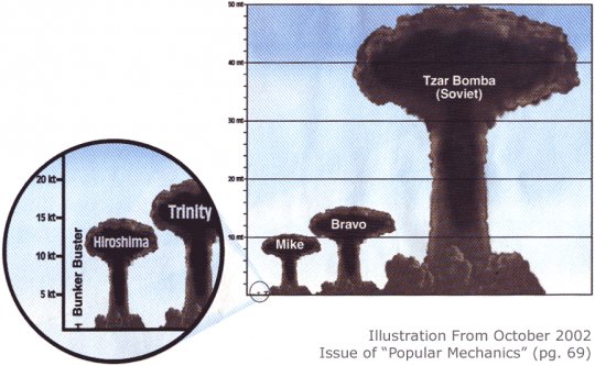
Charts & Graphs: The One-Dimensional Pictograph
While they are informative, bar charts look bland, so people are always looking for ways to spruce them up. One way that we've already looked at (see the Previous Entries, below) is to add a third dimension, but another way is to replace the boring bars with pictures. So, if you're making a graph on, say, how much money the USDA spends on conferences each year (see the Resource, below), instead of a dull bar representing the amount of money spent in a year, why not use a picture of a pig? Or, if you want a chart that compares the yield in tons of TNT of nuclear bombs, replace the unimaginative bars with mushroom clouds (see the example).
Of course, there's nothing wrong with trying to make a boring graph look better, but replacing bars with pictures should not create a misleading impression. In a bar chart, it's the height of the bars that conveys information, and the width of the bars should not vary. However, when pictures replace bars, whether they are pictures of pigs or mushroom clouds, the artist will be tempted to preserve the proportions of the objects portrayed, and the widths of the pictures will increase with their heights. This can easily exaggerate the differences between the columns in the chart, since the viewer is likely to compare the areas of the pictures rather than they're heights. Thus, a picture which is twice the height of a similarly-proportioned picture will appear four times as large.
For instance, look at the clouds labelled "Mike" and "Bravo" in the example: according to the scale at the left, Mike was about a 10 megaton explosion, while Bravo was around fifteen. So, the height of Bravo is half again that of Mike, but its area is more than double, and Bravo will appear more than twice the size of Mike to the casual viewer. Moreover, as Darrell Huff points out (see the Source, below), when three-dimensional objects are portrayed, we may tend to compare their sizes based not on area but on volume, so that Bravo would appear more than three times the size of Mike.
So, don't replace the bars in a bar chart with pictures of objects unless you can keep the widths of the objects fixed while changing their heights. Otherwise, you risk fooling your audience, which is naughty.
Sources:
- Eronarn, "Imagine A Pie Chart Stomping On An Infographic Forever", Smashing Magazine, 5/10/2010
- Darrell Huff, How to Lie with Statistics (1954), Chapter 6
Resource: Charts & Graphs, 9/25/2012
Previous Entries in this Series:
- The Gee-Whiz Line Graph, 3/21/2013
- The Gee-Whiz Bar Graph, 4/4/2013
- Three-Dimensional Pie, 5/5/2013
- The 3D Bar Chart, Part 1, 6/3/2013
- The 3D Bar Chart, Part 2, 7/11/2013
Solution to the Puzzle of the Ex-Presidents: Morgan wore the Ford mask.
To simplify the following explanation, let's call the man who wore the mask of a given president by that president's name: From the first clue, we know that Marvin and the first President Bush were at opposite ends of the line-up. From the third clue, we have that Dennis was on the right end of the line-up―that is, the sixth position―which means that he must be the first Bush and Marvin must be in the first position. Also, from this clue we know that Reagan was in the fifth position. From the fourth clue, we have that Carter was between Oscar and Reagan. Since Reagan was fifth, this means that Oscar was third and Carter fourth. From the second clue, we know that the second Bush was between Keith and Ford, which means that the second Bush must be in the third position―he couldn't be in first position because he's between two others, and he couldn't be second because then he would be between Marvin and Oscar. So, Ford must be second and Keith fourth. We've now filled in all the presidents' positions except for Clinton, who must be in the first position. From the fifth clue, we know that Vern was not in the second position, so he must be in the fifth since that's the only remaining one. This leaves Morgan in second position, wearing the Ford mask.