WEBLOG
Previous Month | RSS/XML | Current | Next Month
January 31st, 2013 (Permalink)
Headlines
Case of Stolen Whiskey Expected to Go to Jury
Jury Gets Drunk Driving Case Here
Source: Richard Lederer, The Bride of Anguished English (2000), pp. 97 & 101
January 28th, 2013 (Permalink)
Why do smart people believe weird things?
Here's the opening paragraph from Michael Shermer's "Skeptic" column from this month's Scientific American (see the Source, below):
If you have pondered how intelligent and educated people can, in the face of overwhelming contradictory evidence, believe that evolution is a myth, that global warming is a hoax, that vaccines cause autism and asthma, that 9/11 was orchestrated by the Bush administration, conjecture no more. The explanation is in what I call logic-tight compartments―modules in the brain analogous to watertight compartments in a ship.
Go read the whole thing, of course―it's not long. In fact, it's so short that it's hard to be sure what he means by "modules in the brain", or how it's supposed to explain the problem he's addressing. However, the column is packed with interesting ideas; probably too packed, since it's hard to figure out exactly what he's getting at. But the article certainly got me thinking, and here are some of those thoughts.
The notion that the mind has distinct parts that function at least somewhat independently, and can even at times come into conflict with one another, goes back at least to Plato. It's an attractive theory because it explains a lot of otherwise inexplicable aspects of human behavior, such as weakness of the will. Here's Shermer's description:
…[T]he brain evolved as a modular, multitasking problem-solving organ―a Swiss Army knife of practical tools in the old metaphor or an app-loaded iPhone…. There is no unified �self� that generates internally consistent and seamlessly coherent beliefs devoid of conflict. Instead we are a collection of distinct but interacting modules often at odds with one another. The module that leads us to crave sweet and fatty foods in the short term is in conflict with the module that monitors our body image and health in the long term. The module for cooperation is in conflict with the one for competition, as are the modules for altruism and avarice or the modules for truth telling and lying.
The notion of a "module" that craves sweet and fatty foods is in line with Plato's division of the soul into appetites and desires that are at times in conflict with reason, which is the sort of internal conflict that modularity explains. However, I'm skeptical―fittingly enough―whether there are modules for such things as cooperation, competition, truth-telling, or lying, as these don't seem to be the sort of things to evolve separately from other functions of the brain.
I'm also doubtful that modularity explains how smart people can believe stupid things. It's obviously true that many otherwise intelligent people seem to be stupid about some things―religion and politics, in particular. However, I doubt that there are religion and politics modules in the brain separate from one's intelligence, though Shermer talks about modules "housing our religious preferences" and "containing our political predilections". We may fail to bring our intelligence to bear on certain issues, rather than because they are in separate modules. Certain beliefs are more dear to us than others, and as a result we often use our intelligence to defend those beliefs rather than to put them to the test, which is usually called "confirmation bias". Confirmation bias seems to be a pervasive failure of human cognition, rather than something having to do with modularity in our beliefs.
Here's something that I guess is supposed to be an example of the kind of bad thinking Shermer is trying to explain:
…[S]ubjects more quickly verified the validity of scientific statements when those statements agreed with their prior naive beliefs.
This is actually a perfectly reasonable thing to do, since all new information needs to be tested against what one already knows. Just because something is called "scientific" by someone doesn't make it so, and most of our "naive" beliefs are true. This, of course, does not mean that new information can never replace our current beliefs; rather, it depends on how secure our "naive" beliefs are, and how much evidence is offered in favor of the new information. All pseudo-science is presented by its proponents as "science"―that's what makes it pseudo ("false") science and not something else, such as religion. It's odd that Shermer, as a skeptic, should present this as if it were a bad thing, since it's the essence of skepticism to demand extraordinary evidence for extraordinary claims, as Carl Sagan used to say. What makes a claim "extraordinary" other than the fact that it conflicts with something we already have solid reasons for believing?
Cognitive dissonance may also be at work in the compartmentalization of beliefs. …[W]hen subjects� closely held beliefs were shaken, they �engaged in more advocacy of their beliefs…than did people whose confidence was not undermined.� Further, …enthusiastic evangelists of a belief may in fact be �boiling over with doubt,� and thus their persistent proselytizing may be a signal that the belief warrants skepticism.
This, of course, was one of the lessons of the classic sociological study reported in Leon Festinger, et al.'s When Prophecy Fails, but it's not clear what connection this has with modularity. If there is cognitive dissonance, it's because the subjects are aware of a contradiction in their belief system. If the beliefs were in "logic-tight compartments" there would be no conflict and, hence, no dissonance.
So, as interesting and full of ideas as this column is, I'm unconvinced that modularity explains the puzzle of intelligent people believing weird things.
Sources:
- Leon Festinger, Henry W. Riecken & Stanley Schachter, When Prophecy Fails (1956)
- Plato, Republic, 435b-437d, 439b-441b
- Michael Shermer, "Logic-Tight Compartments ", Scientific American, 1/2013
January 25th, 2013 (Permalink)
An Outrageous Contextomy
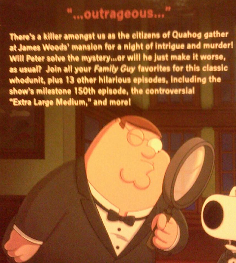
"Nobody said that. It's a lie."―Seth MacFarlane, the creator of Family Guy, when asked about the blurb shown to the right (see the Source, below).
The back of a DVD box―or something, I can't tell for sure what it is―for the television cartoon show Family Guy has the blurb: "…outrageous…". That's it, the single word "outrageous" surrounded by ellipses, and no source given. It's taken so out of context that you can't even tell where it came from. No doubt somebody somewhere sometime said "outrageous", though whether anybody said it about Family Guy I don't know.
This certainly breaks new ground in the blurbing business, though it raises the question: of all the words in the English language, why pick "outrageous"? Is "outrageous" even a compliment? Why not: "…genius…" or "…hilarious…", instead?
Source: "Seth MacFarlane", Twitter, 1/4/2013
Acknowledgment: Thanks to Jim Craft for pointing this out.
January 22nd, 2013 (Permalink)
Q&A
Q: According to your taxonomy, the Reductio ad Hitlerum and Argumentum ad Hominem are both red herrings, but ad Hitlerum falls under Guilt by Association while ad Hominem is a type of Genetic Fallacy. Now, as most people in this field know, some fallacies can be grouped into multiple categories, so I wondered whether it is possible to consider an ad Hitlerum to be an ad Hominem too. I could think of two reasons (which may overlap):
- An ad Hominem "introduces irrelevant premisses about [the] opponent"; when the opponent's proposition coincides with whatever Hitler or the Nazis said, isn't this attacking the opponent's integrity? Or am I using a straw man here because the opponent never claimed to have gotten his/her idea from Hitler or the Nazis?
- An ad Hitlerum is an ad Hominem against Hitler himself, because some of the things he did were wrong, he could never serve as an example of things which are good, so that (even if the opponent actually got his idea from Hitler, like "building more highways") it is automatically seen as wrong because of Hitler's personality. Or am I using an ad Verecundiam here because Hitler is seen as an authority? Or am I using a Red Herring here as long as Hitler is not invoked by the opponent as an authority?
I'm not sure how people in your country respond when someone drops the name "Hitler"; here in the Netherlands it depends, but especially if you talk about the subject for too long for others' liking, they'll suspect you of sympathising with Hitler (which I am not), so just to be on the safe side I'll emphasise I don't. The "building highways" (Autobahnen) example is almost always the only good thing people in my country (that was occupied by the Nazis for five years before you Americans and the other allies liberated us) are able to ascribe to Hitler, so I figured I'd go for that one.―Leon Korteweg
A: If the Hitler card is played against an individual person, then that would certainly be a fallacious ad hominem attack. For instance, suppose that someone who favors gun control is confronted with the claim: "You know who else favored gun control? Hitler!" This is both a Hitler card and an ad hominem.
However, the Hitler card fallacy is often directed at groups or, more abstractly, at beliefs or political positions. For example, some people criticize vegetarians by pointing out Hitler's vegetarianism. If this argument were directed at an individual person, it would be an ad hominem. However, if it's made as a criticism of vegetarians in general, or of vegetarianism as a lifestyle, then that would not be an ad hominem. For this reason, I don't classify the Hitler card as a type of ad hominem attack, even though it may occasionally be used for that purpose.
Similarly, even though the Hitler card is not generally a type of genetic fallacy, some arguments could be instances of both type of fallacy. Of course, Hitler wasn't the first vegetarian and the Nazis did not create vegetarianism; rather, vegetarianism has become associated with Nazism because of Hitler. For this reason, the Hitler card attack on vegetarianism is not an instance of the genetic fallacy but of guilt by association, and the Hitler card is not a subfallacy of the genetic fallacy. However, though I don't know of an example of a Hitler card that commits the genetic fallacy, it can't be ruled out a priori.
January 20th, 2013 (Permalink)
New Book: Guesstimation 2.0
I mentioned Lawrence Weinstein's book Guesstimation some years ago (see the Resource, below). Now, Weinstein has produced a sequel: Guesstimation 2.0: Solving Today's Problems on the Back of a Napkin. These books deal with "back-of-the-envelope" calculations and how to do them, including many examples to work. Being able to do these kind of ballpark estimates is a useful critical thinking skill that deserves more attention. Here's one way to do it.
Resource: The Back of the Envelope, 5/29/2008
January 18th, 2013 (Permalink)
Doublespeak Dictionary
It's from over a year ago, but I just now found a short interview with William Lutz in Computerworld on business doublespeak. At the end, there's a brief list of some additions to the doublespeak dictionary. Check it out.
Source: Jamie Eckle, "Career Watch: Combatting doublespeak", Computerworld, 10/24/2011
January 13th, 2013 (Permalink)
Charts & Graphs
We've seen how interest groups who are the good guys supporting a good cause can still be wrong, exaggerate, tell a one-sided story, or even lie (see the Resource, below). In fact, it may even be psychologically easier for people who are convinced that their cause is just to deceive the rest of us in pursuit of it: the good ends may seem to justify the bad means. For this reason, we need to be just as much on our guard against propaganda put out by those we agree with as by those with whom we disagree.
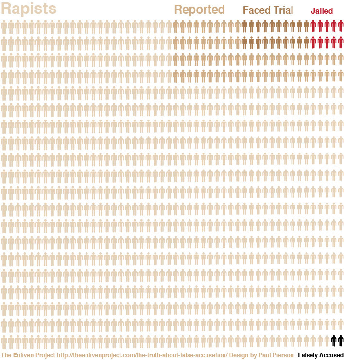
An interest group called "The Enliven Project" is fighting against rape and sexual assault, which is certainly a good cause: Who isn't against rape? However, the project is promoting the graphic displayed to the right, and there are many things wrong with it. Let us count the ways:
- First of all, this is not a good type of graph for displaying this kind of information. The point of the graph is apparently to compare the total number of rapists with the subset of those accused, the subset of those accused who face trial, the subset of those tried who are then jailed, as well as those who are falsely accused. However, the way the graphic is constructed makes it difficult to compare the sizes of these sets; about the best that you can do is tell that the number of rapists is several times larger than the number of those reported, which is itself several times larger than the number who are tried, about a third of whom serve time. Also, the graphic shows that the number of rapists is overwhelmingly greater than the number of those falsely accused.
- There's also a conceptual problem: At first glance, it appears that the entire block of little men represents all rapists, and this is what the legend in the upper left corner seems to indicate. However, the two black little men in the lower right corner are supposed to represent those falsely accused, but does that mean rapists falsely accused of rape? I suppose that can happen, but I assume that the numbers of falsely accused rapists would be even smaller than shown in the graphic. Instead, the two little men are supposed to represent innocent men falsely accused of rape. As such, the two falsely accused men should be separate from the set of rapists. Amanda Marcotte―see the Source, below―suggests that the graphic should represent rapes rather than rapists, but then why use figures of little men? In that case, it would be better to switch to a different type of graphic, such as a bar chart.
- A similar conceptual problem comes from the subsets of those little men who were "Reported" or "Faced Trial", but not "Jailed". Presumably, these represent the number of rape accusations made to the authorities, the number of rape trials conducted, and the number of convictions leading to jail time. However, it's at least possible, and probably likely, that some of those who were "Reported" but not tried, or "Faced Trial" but were not "Jailed", were innocent men falsely accused. However, by representing these numbers in terms of little rapists, the graphic assumes that every man accused of rape is in fact a rapist, even when acquited at trial.
- According to Amanda Marcotte, the numbers in the graphic come from estimates of the number of rapes committed, reported, prosecuted, and punished. This means that the little men can represent rapists only if it is assumed that every rape is committed by a different man, that is, that there is a one-to-one correspondence between rapes and rapists. However, it's much more likely that most rapists commit multiple rapes, in which case the proportions in the graphic will be all wrong: the number of rapists who are reported, tried, and jailed will be a much larger proportion of the total number of "rapists" shown in the diagram, since most rapists are responsible for more than one rape. This is enough to render the graphic misleading since it gives a false impression of the proportions between these classes.
- In addition, most of the statistics shown in the graphic are estimates, and there are often widely different ones from different sources to choose from, or the estimates are actually ranges. In each case, the project seems to have selected numbers in order to exaggerate the point that they wished to make, namely, that there are a tiny number of false accusations of rape in comparison to actual rapes. For instance, the graphic shows false accusations as 2% of all rape accusations, whereas the actual statistic is a range: 2-8%. So, the project chose the low end of the range in order to minimize the size of the group of falsely accused. Of course, in a graphic such as this, it would be difficult to represent a range of values; however, that's one more reason not to use this type of graphic, and there are other types of chart in which ranges can be shown. Moreover, if you must choose a single value from a range, you can choose the center of the range―in this case, 5%―or you can choose conservatively, which would be the top end of the range: 8%.
There may be additional things wrong with this graphic, especially if you dig into the underlying statistics of rape, which are very uncertain. Nonetheless, the above points are sufficient to show that the graphic is only good for misleading people.
Sources:
- Sarah Beaulieu, "The Challenge of Data", The Enliven Project, 1/7/2013
- Sarah Beaulieu, "The Truth about False Accusation", The Enliven Project, 12/1/2012
- Amanda Marcotte, "This Rape Infographic Is Going Viral. Too Bad It's Wrong.", Slate, 1/8/2013
Resource: Caveat Lector, 6/25/2007
Previous Charts & Graphs:
- Hey, Big Spender, 6/1/2012
- Charts and Graphs, 6/4/2012
- A "Gee-Whiz" Graph, 8/14/2012
- Charts & Graphs, 9/25/2012
Update: This graphic was posted initially without skepticism on The Washington Post's "Wonkblog"―see the Source, below―from which it appears to have spread via social media. Subsequently, a tepid warning that the statistics of rape are doubtful was appended, together with a link to Marcotte's criticism. Since then, Patrick Pexton, The Post's ombudsman, has written a column about the graphic. Pexton doesn't have much to say about what's wrong with it, except the following:
I read the studies that underlay the infographic and its critiques. Individually, some of the statistics that Enliven used do appear in the studies. But Enliven made assumptions and extrapolations in consolidating this information into one graphic, rendering it misleading.
However, his main concern is the relation between "Wonkblog" and The Post, and the graphic's effect upon their credibility:
The blog post generated a lot of Web hits for The Post and the Enliven Project. It stirred controversy and discussion of sexual violence. But it damaged Wonkblog�s credibility, and that of The Post, and harmed the legitimate issue of addressing violence against women. Real reporting takes time, analysis, and inquiry. Post bloggers need to be more careful.
Sources:
- Dylan Matthews, "Wonkblog: The saddest graph you�ll see today", The Washington Post, 1/7/2013
- Patrick B. Pexton, "A flawed image of rape on Wonkblog", The Washington Post, 1/11/2013
January 9th, 2013 (Permalink)
Wikipedia Watch
Last year, we heard about a college professor whose class hoaxed Wikipedia―see the final Resource, below. Thankfully, that was shortlived, but now there's news of a five-year hoax that has just been uncovered―see the Sources, below.
These hoaxes reveal one of the problems with Wikipedia. While a traditional encyclopedia will no doubt contain errors, omissions, and bias, it's highly unlikely that a detailed hoax such as "The Bicholim Conflict" would occur, and I've never heard of one.
This is one reason, and a sufficient one at that, why Wikipedia should not be treated as a standard encyclopedia. At the very least, everything in it should be doublechecked with a second, independent source before accepting it. "Trust, but verify", should be the watchword for Wikipedia.
The fact that it has the suffix "-pedia" may fool people into thinking that Wikipedia is an encyclopedia like any other, except that it's free, but "you get what you pay for" as the old saying goes. Though you don't have to pay money to access it, or pay by having your eyeballs assaulted with ads, nonetheless you do pay a price when you rely solely on Wikipedia.
Sources:
- "Hoax article on Wikipedia for 5 years", UPI, 1/4/2013
- Kevin Morris, "After a half-decade, massive Wikipedia hoax finally exposed", The Daily Dot, 1/1/2013
Previous Wikipedia Watches: 6/30/2008, 10/22/2008, 1/25/2009, 3/22/2009, 7/21/2009
Resources:
- "List of hoaxes on Wikipedia", Wikipedia
- A Contextomy and a Contradiction, 2/10/2005
- More Wikipedia Illogic, 4/30/2005
- Fact-Checking Wikipedia, 2/23/2012
- How to Hoax Wikipedia, 5/16/2012
January 4th, 2013 (Permalink)
Check it Out
The Numbers Guy―alias Carl Bialik―has a column―see the Source, below―on some helpful ways of thinking about media reports of statistics in the new year. These suggestions are good ones for any year, so read the whole thing, to recoin a phrase. Here's some further information about the topics Bialik discusses:
- Misleading Precision:
"A major concern running through the responses is that data tend to be fuzzy―much fuzzier than they can seem when stated with neither margins of error nor qualification. … Many readers agreed. …[One] asked for reports on job numbers and economic forecasts to include estimates of uncertainty―the statistical margin of error that is common in poll reporting. 'I never see them mentioned,' he said."
In the U.S., at least, there is a journalistic standard to report the margin of error of political polls, even though reporters often ignore that margin in their analysis of the poll. Unfortunately, however, there's no such standard established for economic or medical reporting. So, reader beware!
Resources:
- Regression to the Mean:
"A company or athlete on a hot streak may be really good, but likely isn't as good as, say, two record weeks would suggest. Statisticians call this phenomenon regression to the mean…."
For more on this statistical phenomenon, see the following:
Resource: The Regression Fallacy
- Adjusting for Inflation:
"Context can…help temper excitement about apparent record breakers. That box-office mark? Try adjusting it for ticket-price inflation."
This is one of my pet peeves, and you have to watch out for it in any comparison of amounts of money from different time periods in the popular media. Never assume that figures have been adjusted for inflation, as most of the time they won't be. Typically, reports of new movies setting box-office records, or record-high gas prices, will be based on unadjusted figures. Therefore, such "records" will be only nominal, not real. Sometimes the report itself will mention this fact, but only near the end of the article. Again, reader beware!
- The Lottery Fallacy:
"Seemingly improbable events do happen. People win the lottery twice, have three children years apart with the same birth date, or bump into old acquaintances on the other side of the world. To the people involved, such occurrences may seem providential, but it is worth remembering that with seven billion people in the world, the same thing could happen to a lot of people. The probability of a seemingly surprising coincidence, like winning the lottery twice, 'is actually quite high, if you mean anyone, anytime' winning for a second time…."
I discussed this issue at some length in the narrower context of the "fine-tuning" argument for the existence of a god―see the Resources, below.
Resources:
- The Arguments that Failed, 3: The "Fine-Tuning" Argument, 1/20/2009
- New Book: The Fallacy of Fine-Tuning, 6/19/2011
- Fine-Tuning the Fine-Tuning Argument, 6/27/2011
- One Universe is Enough!, 8/7/2011
Source: Carl Bialik, "Statistical Habits to Add, or Subtract, in 2013", The Wall Street Journal, 12/28/2012
Update (1/7/2013):
Bialik also has a weblog entry with some additional topics:
- Charts & Graphs:
"Kelly Jackson, who teaches at Camden County College in Blackwood, N.J., would like to see better practices in charting, where the Y-axis should always start at 0 when possible. 'One of the problems my students have is interpreting data and graphs that don�t use �0' as the starting point,' Jackson said. 'Imagine a graph that starts vertically at 500 and shows bars of height 550 and 600.'"
For some examples of this type of chart, as well as discussion of why they can be misleading, see the following resources, or Huff's How to Lie with Statistics:
Resources:
- Charts and Graphs, 6/4/2012
- A "Gee-Whiz" Graph, 8/14/2012
- Darrell Huff, How to Lie with Statistics (1954), Chapter 5: "The Gee-Whiz Graph"
- Correlation≠Cause:
"Judea Pearl, director of the Cognitive Systems Laboratory at the University of California, Los Angeles, cites as a statistical pet peeve 'the century-old confusion between correlation and causation'…."
This has been a frequent, recurring theme of this weblog, so I won't point to any particular entries, but to the following fallacy:
Resource: Non Causa Pro Causa
- Polling All Polls
"Brad Carlin, professor and head of biostatistics at the University of Minnesota, mentioned a lesson from the success of Nate Silver, election forecaster for the New York Times: 'Never believe in just one poll; always take some sort of average of all the polls you respect.' Other forecasters who also aggregated polls had success in this election cycle."
This is a point I discussed in the following section of the piece on polls:
Resource: How to Read a Poll: Polling the Polls
- BOTEC!
"New York University mathematics professor Sylvain Cappell…added that sometimes simple computations, not complex ones, can suffice to aid in decisionmaking. 'It�s amazing, even in our complex modern world, how many assertions fail simple "back of the envelope" reasonable estimates with elementary computations,' he said."
This is a hobbyhorse that I've been riding now for a few years; in particular, I wish that teachers of critical thinking would teach how to do back-of-the-envelope calculations (BOTECs). In the meantime, I've tried to lead by example:
Resources:
- Caveat Lector, 6/25/2007
- The Back of the Envelope, 5/29/2008
- Who is Homeless?, 3/30/2009
- The Back of the Envelope, 7/2/2009
- The Back of the Envelope, 8/15/2009
- BOTEC, 11/14/2010
- How Not to Do a "Back of the Envelope" Calculation, 11/18/2010
- BOTEC, 2/6/2011
- Go Figure!, 3/6/2011
- Be your own fact checker!, 2/15/2012
Source: Carl Bialik, "Tips for a Statistically Savvy 2013", The Numbers Guy, 12/28/2012
January 1st, 2013 (Permalink)
A New Puzzling List for a New Year
How many, if any, sentences on the following list are true, and how many false, if any? Which are true and which false?
- At least one of the statements on this list is false.
- At least two of the statements on this list are false.
- At least three of the statements on this list are false.
There are eight distributions of true and false among the three sentences, so it's fairly easy to check that each distribution is impossible. For instance, if all three sentences were true, then all three would have to be false, since that's what the third one says. So, at most two could be true; let's assume so.
Notice that each sentence on the list implies any previous sentence; that is, that at least three sentences on the list are false implies that at least two are, which implies that at least one is. Therefore, the third sentence must be the false one. So, the first two sentences are true. However, if the second one is true, then at least two of the sentences must be false, since that's what it says. This contradicts the assumption that two sentences on the list are true. So, at most one is.
However, if only one sentence on the list is true, then two must be false. This means that the second sentence will be true, but we've seen that the second implies the first, which would mean that two sentences were true, violating our assumption. Therefore, none of the sentences can be true.
However, if all three sentences were false, then all would be true, given what each sentence says. So, every distribution of true and false leads to a contradiction. What, then, can we conclude about the list?
The list is not just puzzling, it's paradoxical! The assumption that the sentences on the list are true or false leads to a contradiction, no matter how we distribute truth and falsity among them. From this it follows, by reductio ad absurdum, that the assumption that the sentences are either true or false is itself false, that is, none of the sentences is true or false.
In fact, the list is a variation on the famous Liar's Paradox. Consider the shortest possible version of the list:
- At least one of the statements on this list is false.
Since there's only one sentence on the list, it says of itself that it is false. Such paradoxical sentences are neither true nor false.
Source: Martin Gardner, Knotted Doughnuts and Other Mathematical Entertainments (1986). The puzzle was suggested by one on page 70.
Resources:
- A Third Puzzling List, 11/7/2012
- A Fourth Puzzling List, 12/1/2012