WEBLOG
Previous Month | RSS/XML | Current | Next Month
April 26th, 2013 (Permalink)
There ain't no such thing as a free lunch in logic!
Ted Grant emails the following question:
As far as I can tell, logical arguments can be used to prove logical things exist but they can't be used to prove physical things exist. For example, it might be possible to prove that negative numbers exist or that a solution to an equation exists, but such arguments have no direct connection with the physical world. You cannot prove an apple exists using logic alone; there has to be some physical evidence that the apple in question exists. So it seems to me that some of the arguments for the existence of God must be fallacious because they are logical arguments and God is supposed to be a real physical being, not just some logical construct. So assuming you agree with this line of reasoning, what kind of fallacy am I discussing?
Let's get a couple of things straight before we try to answer your question:
- I'm sure that some religious people would object to calling God a "real physical being", claiming instead that God is a purely spiritual being, whatever that means. Of course, according to Christianity, Jesus was God and was also as much a real physical being as any other human being, and views to the contrary―such as Docetism―were declared heretical long ago. Nonetheless, God is supposed to have at least created the world, and possibly to have causally intervened in its history, which is something that an abstract entity―such as a number―cannot do. So, let's put aside the issue of whether God is a physical or purely spiritual being, and reframe the question as one of whether it's possible to prove the existence of non-abstract entities that have causal effects in the world.
- By the phrase "logical argument" I think you have in mind a deductive argument, that is, an argument whose premisses necessitate its conclusion. It's possible to make a non-deductive argument for the existence of God, and some have been made, but the best-known arguments are clearly deductive, such as the famous "ontological" argument. However, the arguments that we give for the existence of physical objects are usually inductive rather than deductive, because the premisses make the conclusion probable at best, rather than necessitating it.
- With those points in mind, let's reformulate your question: What, if any, fallacy is committed by deductive arguments for the existence of God?
How is it possible for the premisses of a deductive argument to necessitate its conclusion? This happens because the information contained in the conclusion is already semantically included in the premisses, so that if the information in the premisses is true then that in the conclusion must also be true. This point is easiest to see through examples of deductive reasoning, though it's by no means always obvious―if it were, then deductive reasoning would be unnecessary, since we would simply "see" all of the information contained in the premisses. A deductive argument is useful for making explicit in its conclusion information that is only implicit in its premisses.
So, in a deductive argument, you pay in the premisses for what you get in the conclusion; or, to put it another way, there's no free lunch in deduction. There's a trade-off between the strength of the logical connection between premisses and conclusion and the extent to which the conclusion goes beyond the premisses. In deduction, the conclusion is connected to the premisses in the strongest possible way―namely, with necessity―but it achieves this connection by not going beyond the premisses at all. In induction, the conclusion goes beyond what's contained in the premisses, but at the cost of a weaker connection with them: probability only.
At this point, we can see what's wrong with deductive arguments for the existence of God, even those that are valid: anyone who doubts the conclusion of such an argument should doubt the premisses as much or more. In other words, such arguments are circular―they beg the question. A valid deductive argument cannot force you to accept its conclusion; rather, it forces you to choose: either accept the conclusion or reject at least one of the premisses. If the conclusion is sufficiently implausible, that means that there's something equally implausible in the premisses. Find it!
This is why attempting to prove the existence of God in the same way that a theorem in logic or mathematics is proved is a fool's errand: even if such an argument were valid, it should fail to convince anyone skeptical about its conclusion. However, most of the traditional deductive arguments for the existence of God are not even valid, for various reasons that I won't go into here―if you're interested, check out John Allen Paulos' book Irreligion for a short, non-technical introduction.
Fallacy: Begging the Question

April 20th, 2013 (Permalink)
An Unprecedented Contextomy
An ad in yesterday's New York Times for the new documentary War on Whistleblowers includes the blurb: "UNPRECEDENTED!"-Tom Devine, THE GUARDIAN.
I've never seen this single word used in a movie blurb before, so I guess that makes this an unprecedented blurb. However, I wonder exactly what it's supposed to mean in this contextomized context; for instance, is it even necessarily a compliment to call a movie "unprecedented"? In what way is it unprecedented? Could it be unprecedentedly bad?
I've cautioned before to be wary of the one-word blurb, since it's so easy for a single word to be taken misleadingly out of context, and that's certainly the case here. Here's the passage from the article in which the word has its sole occurrence:
In a film out this week, War on Whistleblowers, the New York Times' David Carr says: "The Obama administration came to power promising the most transparent administration in history…and began prosecuting [whistleblowers] every which way." … As this important documentary exposes, so far the tactic has been prosecuting or harassing national security whistleblowers. … The Whistleblower Protection Enhancement Act (WPEA) provides unprecedented employment protections. … [Highlighting added, of course.]
So, the word doesn't refer to the film at all, but to the WPEA. In fact, the article from which it comes is not a review of the movie, but a critique of the Obama administration's policies on whistleblowing, and only mentions the documentary at the beginning. However, it's puzzling that the ad didn't use the one word from the article that did characterize the movie: "IMPORTANT!"
Sometimes the ways of the ad writer are mysterious.
Sources:
- Ad for War on Whistleblowers, The New York Times, 4/19/2013, p. C14
- "Word of the Day: Serendipity", News & Events from the Davenport Public Library, 4/25/2012
- Tom Devine, "Obama's dangerously contradictory stance on whistleblowing", The Guardian, 4/16/2013

April 17th, 2013 (Permalink)
The $604 Question
Rob Rhinehart: "How I Stopped Eating Food"
The above headline is from a San Francisco Chronicle article about a man who supposedly "stopped eating food". Of course, it's possible to stop eating―for awhile. However, the headline is one of those misleading tabloid headlines aimed at tricking you into reading the article by suggesting something surprising but false. No, the man in question, Rob Rhinehart, is not a "breatharian". He did not stop consuming food, though he did stop "eating" it―he's drinking it, instead. Rhinehart created a beverage in his kitchen that supposedly supplies all of the protein, fat, carbohydrates, vitamins and minerals that the human body needs. Oddly enough, he calls this stuff "soylent", though this soylent isn't people.
Assuming it doesn't kill you, one of the supposed advantages of this diet, according to its creator, is economic:
The average American spends $604 per month on food. But given that Soylent only costs Rhinehart about $50 per month, he's very excited at the prospect of feeding people in developing countries.
Before we nominate Rhinehart for the Nobel prize, let's examine these claims a little closer. These two sentences should raise a lot of questions in your mind. For instance, do you spend $604 a month on food? If you're like me, you probably don't know exactly how much you do spend, but $20 per day seems rather high. I suppose that you might spend that much if you eat out every single day, or cook gourmet meals at home, but how many Americans do that and how "average" would they be?
Also, who's an "average American"? The answer is that no one is an "average" American (see the Resource, below): what the author of the article is trying to say is that Americans on average spend $604 for food in a month. That number is very precise, though, which may impress people into thinking it must be very scientific. But if it's an average, then it must be based on a sample survey of Americans―after all, who could afford to find out from every American how much they spend on food? So, what's the margin of error, and isn't it likely to be greater than four dollars? If so, why wouldn't the author write that Americans spend approximately $600 a month for food? That wouldn't sound so impressive, but it would actually be more scientific.
Moreover, in what sense is our "average American" average? Is it the mean, median, or the mode? As I've explained in the Resource, each of these statistical measures can be called an "average", and when used to measure matters involving money, such as income or spending, these three "averages" may be quite different.
So, let's turn to the source given by the article to see if we can answer some of these questions. At the point where the article makes the claim in question, it links to a report from the Gallup polling company (see Source 2, below). The most remarkable thing about this survey is that the question upon which the $604 average is based is the following: "On the average, about how much does your family spend on food each week? [Emphasis added.]" The mean is $151, and four weeks per month explains where $604 came from. However, that's $604 per family, not per "average American". Given that there must be at least two people per family, the mean for the individual American will be no more than $302 per month, and since the "average family" probably has more than two members, that mean will be lower still.
The Gallup report also answers our other questions: The margin of sampling error for the spending average is ±$7, so that $604 definitely gives an illusion of accuracy. $604 is the mean, whereas the median is only $500 per month. The median is often a more accurate measure of typical spending since the mean is pulled higher by big spenders, such as those who eat out a lot or choose expensive foods. Also, given that the question asked about families, large families are likely to spend more on food than small ones. In fact, we see this pattern in Gallup's results: the distribution has two peaks, one at $100-$124 and the other at $200-$299. So, given that the median is a better average than the mean, the "average American" that we're concerned about would actually spend no more than $250 a month on food, and probably less. That's a lot less than $604, but it's still five times as much as what Rhinehart claims to spend on his soylent.
This raises another question about the article: given that even a quick glance at the source of the $604 claim would reveal that it refers to an "average family", and not an "average American", how did this get published in The San Francisco Chronicle? Even if the newspaper can't afford fact-checkers, aren't journalists themselves expected to do at least minimal fact-checking of their stories? And if something like this managed to slip by the reporter, aren't editors supposed to check the basic facts before printing the story?
One explanation, though not a satisfying one, is that the article was taken from a "blog" post written by Rhinehart himself (see Source 3, below), apparently without even minimal checking. Here's what the post currently says about the expense of soylent compared to food:
Monthly I was spending about $220 on groceries, and another $250 eating out for lunch and the occasional dinner. The average american spends $604/month on food, about half of which is groceries. … Consuming only Soylent costs me about $50/month…. At scale the cost would be even lower.Edit: this was a miscalculation from a mistake in my spreadsheet, at personal scale it actually costs me exactly $154.82/month.
Somehow this edit didn't make it into the Chronicle story, even as a correction. At least they're consistent! Interestingly, Rhinehart himself claims to spend less on food per month than that incorrect average. However, the corrected cost of soylent is actually only $100 less per month than the corrected average, rather than the original $550 difference. How much do you want to bet that if this stuff is ever manufactured and sold it will cost more to live on than to eat regular food? It will probably be marketed as healthier or more convenient than solid food, rather than as cheaper.
So, this example is a warning not to believe everything you read in the media, even respectable newspapers. Nowadays you have to be your own fact-checker.
Sources:
- "Eat Family First?", Funny Signs
- Dylan Love, "Rob Rhinehart: 'How I Stopped Eating Food'", San Francisco Chronicle, 3/20/2013
- Elizabeth Mendes, "Americans Spend $151 a Week on Food; the High-Income, $180", Gallup, 8/2/2012
- Rob Rhinehart, "How I Stopped Eating Food", Mostly Harmless, 2/13/2013
Resource: "Average" Ambiguity, 11/4/2002
Fallacy: Overprecision
April 4th, 2013 (Permalink)
Charts & Graphs: The Gee-Whiz Bar Graph
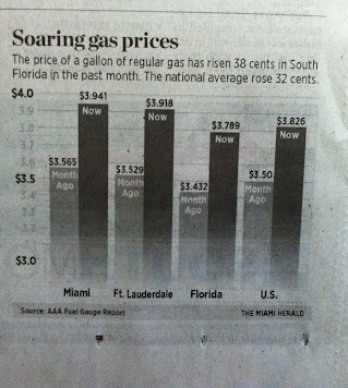
Bar graphs are useful for visually comparing quantities when the heights of the bars are proportional to the quantities they represent. However, if a bar chart is truncated―that is, the bottom part of the chart, including the zero baseline, is removed―the heights of the bars will no longer be in proportion to the quantities they represent, with the effect of exaggerating the differences between those quantities. We've seen examples of this type of chart before (see the Resources, below) and it seems to be one of the most common types of misleading graph, if not the most. As an example, see the graph to the right (from Source 1, below).
At a glance, it appears that gas prices in both Florida cities, the state as a whole, as well the country, have "soared" about 50%. This impression results from comparing the heights of the bars with the naked eye, and the impression is reinforced by the chart's caption. However, a closer look shows that the baseline of the graph is not zero: in fact, it's hard to tell exactly where the baseline is because the chart fades away at the bottom, but the lowest value that can be read on the scale is $3. The actual growth of gas prices in all four areas is around 10% so that the chart visually exaggerates the rise by about fivefold. This is a graphical manifestation of the news media's desire to make a big deal out of every rise in gas prices, which we've seen previously in their failure to adjust prices for the effects of inflation.
So, the moral of this installment is similar to that for the first: when looking at a bar graph, be sure to check that the baseline starts at zero. If not, then you can't compare the sizes of the data by the sizes of the bars, which is the whole point of such a chart. A truncated bar chart is almost bound to be a misleading one.
Sources:
- Alberto Cairo, "Infographics as a proxy for overall news quality", The Functional Art, 8/31/2012
- Darrell Huff, How to Lie with Statistics (1954), Chapter 5: "The Gee-Whiz Graph"
Resources:
- Charts and Graphs, 6/4/2012
- A "Gee-Whiz" Graph, 8/14/2012
Previous Entry in this Series: Charts and Graphs: The Gee-Whiz Line Graph, 3/21/2013
April 3rd, 2013 (Permalink)
New Book: Math on Trial
The new book Math on Trial: How Numbers Get Used and Abused in the Courtroom, by mathematician Leila Schneps and her daughter, looks very interesting. I haven't read it yet, but judging from the chapter titles and the Amazon "Look Inside!" feature, it deals primarily with probability theory and statistics, which makes sense given its subject matter. The first chapter concerns the tragic case of Sally Clark, and a later one the Lucia de Berk case, both of which I've alluded to previously (see the Resources, below). There's also a chapter on the Amanda Knox case that's been back in the news recently (see Source 1, below). Statistical fallacies that play a role in these cases include the so-called "prosecutor's" fallacy―which needs a more accurate name, since not only prosecutors commit it―and the mistake of multiplying non-independent probabilities―which is more a definition than a name. This book may also answer the question "where's the harm?", since it shows that fallacious reasoning can put innocent people in prison or leave the guilty free to commit more crimes.
Sources:
- Leila Schneps & Coralie Colmez, "Justice Flunks Math", The New York Times, 3/26/2013
- Leila Schneps & Coralie Colmez, "Mathematics in Forensic Science", The Huffington Post, 3/25/2013
Resources:
- The Prosecutor's Fallacy, 10/30/2006
- Check 'Em Out, 9/23/2009
April 1st, 2013 (Permalink)
An April Fool's Puzzle
Will the puzzle you solve before you solve the puzzle you solve after you solve this one be harder to solve than the puzzle you solve after you solved the puzzle you solved before you solved this one?
Perhaps the easiest way to solve this is to work inside out, step-by-step, using symbols for the different puzzles referred to: "this one" obviously refers to the puzzle itself, so let's abbreviate it as P1. Thus, the puzzling question becomes:
Will the puzzle you solve before you solve the puzzle you solve after you solve P1 be harder to solve than the puzzle you solve after you solved the puzzle you solved before you solved P1?
Let "the puzzle you solve after you solve P1" be symbolized as P2, and the question becomes:
Will the puzzle you solve before you solve P2 be harder to solve than the puzzle you solve after you solved the puzzle you solved before you solved P1?
Now, since P2 is the puzzle you solve after P1, "the puzzle you solve before you solve P2" is just P1, so that the question becomes:
Will P1 be harder to solve than the puzzle you solve after you solved the puzzle you solved before you solved P1?
That takes care of the puzzle referred to in the first half of the question, so proceed in the same way with the second half. Let P0 refer to "the puzzle you solved before you solved P1":
Will P1 be harder to solve than the puzzle you solve after you solved P0?
Now, since P0 is the puzzle you solved before you solved P1, it follows that "the puzzle you solve after you solved P0" is P1 itself, so that the whole question just amounts to:
Will P1 be harder to solve than P1?
In other words, will this puzzle be harder to solve than itself? Obviously, the answer is "no".
Source: Gerald L. Kaufman, The Book of Modern Puzzles (1954). The puzzle was suggested by one on page 93.